O'Reilly Science Art holiday party of two

This year for the office holiday party I invited my closest and most trusted business associate, my fiercest critic and most ardent supporter, the hubs. We went to a tiny Japanese restaurant and ate tiny food and drank rice beer and sweet stout. I wish I could say that the porcelain characters accompanying us were our secret Santa gifts (the sombrero-clad owl holding up a waving frog would look amazing on my desk) but they were just part of the decor. I also wish I could say that we took full advantage of having a babysitter but by 10pm we were so. very. tired. In somewhat related news I've decided that for the time being, The Short Answer will be coming out every other month, which it sort of already has been lately, but now I won't feel badly about it. Someday when the childcare:workload ratio is a little more amenable to side projects I hope to return to monthly installments. 

Happy Holidays!!!

A parting gift amidst wistful musings

Today is my three-year old son's last day at Little Thinkers, a preschool that was designed for two year olds and young three year olds. It's time for him to move up to big boy preschool. I suspect that a tear or two will be shed (by me) as we say goodbye to this very special little place. To say thanks for helping usher the little guy into becoming a happily functioning member of toddler society, I made this sign and framed it for them. The little bird is from one of the many art projects that were brought home (and for my own amusement, reminiscent of Portlandia's "Put a Bird on It" sketch). I just photoshopped it in from a picture I took of it. (I snapped photos of his art projects because if we actually kept them all we would need to rent a storage unit. Shhhh...).  The only thing that makes me a little less sad today is knowing that we'll be back with the littler guy in about a year and a half.  

A tale of two covers

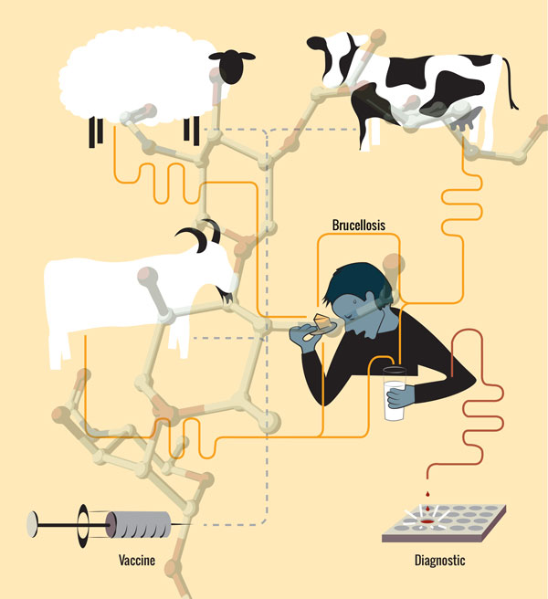
Big week, though you'll have to take my word for it. This week two journals came out whose covers I had a hand in. The first one is this JACS cover, which I actually made. However, due to an unfortunate policy, illustrators who create cover art for JACS are made to relinquish copyright and are not given credit for the work. This is not uncommon - it is called work-for-hire (and considered a scourge by many artists). The part that seems a little unfair to me is that I was paid for the artwork by the authors, not the journal. Nevertheless, I'm happy that I was able to get the cover for my client. 

© American Chemical Society

© American Chemical Society

Below is the alternate design that I gave my clients to send to JACS for consideration. The editors, as did we, preferred the one above. To give a little more context, the paper is about the teasing out of the precise molecular determinant of antibody recognition in Brucellosis, a highly contagious disease that can be passed from animals to humans via tainted milk or cheese, or just by very close contact (karma for cow-tippers?). The finding of a specific disaccharide on the Brucella bacteria that antibodies bind to opens up new possibilities in diagnostics and potentially a vaccine for the the disease. 

The next cover of note is Nature. The mock-up below is not the cover of the November 20th issue of Nature, but according to my client, for whom I made this image as candidate cover art, it was used as the inspiration for it. My image is meant to be a Venn diagram that represents the comparison of mouse and human genomes and the identification of functional DNA sequences. They discovered many of these functional units, some unique and some common between the two species, through both mining the sequences and some good old biochemistry. From this they were able to learn about which DNA regulatory elements diverged between these species in the course of evolution. It is actually a series of papers that describes an incredible tour de force. The cover that the Nature team created depicts two human heads facing away from each other and overlapping, wherein the overlapping region was made to look like a mouse. I don't think it's meant to be a Venn diagram any longer. It's as though they are both thinking the same thought. Mice! You rascally little rodents. Oh how we've diverged from you evolutionarily and yet kept some DNA regulatory elements in common. Please continue to be our lab slaves evermore.

Logo Biz

So it seems that the certificate in graphic design that I completed at UCSD is paying off. Here are a couple of logos that I designed just over the past few months.

For the first one, the clients asked me to incorporate neurons and a road into a black and white logo.  The little sausages refer to the fact that their work relates more specifically to myelin.   

The second one was for a chemistry professor at the University of San Diego who is starting up a network of local polymer scientists here in San Diego called San Diego Polygrid. His only request was to have a polymer sort of intertwined somewhere, like vines on a trellis. The driving force behind this group is the desire to bring together people and ideas, and possibly promote more collaboration, so I have two polymers using the word "grid" to bring together otherwise distant ligands. For you chemists out there, I was inspired by the concept of increased effective concentration. And I just realized as I'm writing this that this one also has little sausages (polymer monomers). In possibly related news, I spent the better part of my recent pregnancy with an overwhelming craving for kielbasa. 

The short answer

A ghoul ate my The Short Answer! Happy Halloween and we'll see you back here in November. 

Better late than never

After some lengthy and heated contract negotiations with white lab mouse #2, we are back. Forgive me if there are any typos - I haven't had more than three consecutive hours of sleep in over a month.

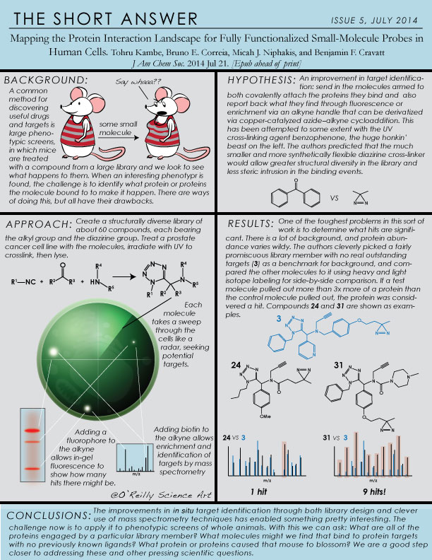
The Short Answer, Issue #5

I have to admit, this one sort of snuck up on me. Earlier this week I realized that today, and not next Friday, is the last Friday in July. How am I supposed to remember that there aren't 32 days in July? I know there's some knuckle trick but I can't be bothered. The good news is that this paper is hot off the presses, published online four days ago, and it's pretty interesting. Here's the pdf.

It's alive! It's ALIVE!

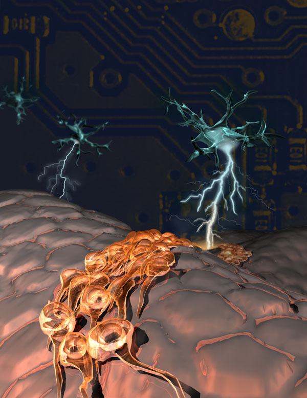
Here is another piece of candidate cover art, this time for Nature Neuroscience. The authors have discovered a new type of neuron whose electrical action potential can trigger stem cells in the adult brain to make new neurons. Hooray! 

Candidate Cover Art for PNAS

It's been too long since I've shared any real illustrations, so it's about time. Dong Wang's group at UCSD has used sophisticated computer simulations to track the movement of an RNA polymerase along a DNA template at atomic resolution and on the millisecond timescale. They were able to get information that you just can't get from X-ray crystal structures, and identified two intermediate states that no one had ever known of before.

Though I actually may have believed that I had invented the idea that NMR and computational dynamics are to X-ray crystallography what film reels are to polaroid snapshots (first way back here), I suspect that may not be the case, and now that it's been used by someone else on the cover of this month's Nature Chemical Biology, I know it's time to retire the analogy, at least for my purposes.  

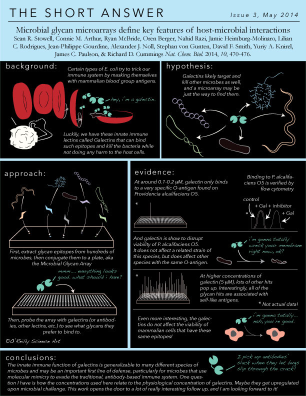
The Short Answer, Issue #3

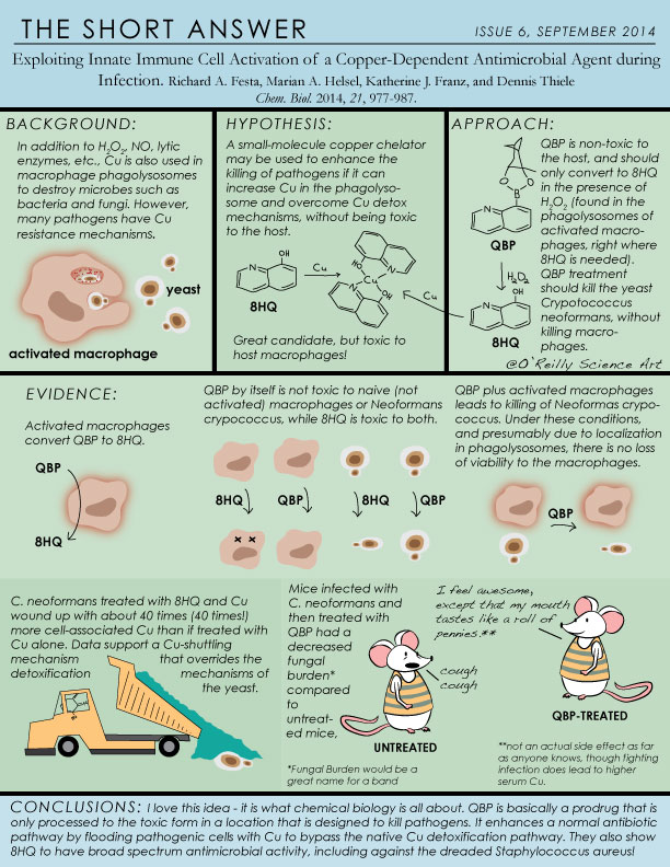
I started this little series when business was a bit slow, and shortly thereafter I happily became very busy for a couple of months with three cover art candidates, two TOC graphics, a figure for a review article and another for a biotech's slide deck, and one very touching gift from some graduating seniors for their beloved undergraduate research advisor. So sometimes, "The Short Answer" will very literally live up to its name, such as in this particular installment. Here, I really picked out what I found most compelling and glossed over many details (maybe that is the point of this thing anyway?). There's plenty more meat to the story so I recommend checking out the full paper if you're interested. 

As always, click here for a pdf version, in case you don't have your magnifying glass handy. To see older installments you can check out the "archive" (of two additional issues) here


My thumb is famous. I have arrived.

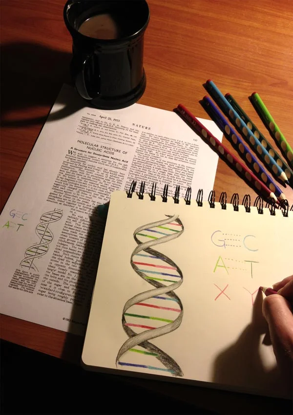
Yesterday a big story hit multiple news outlets - that of a living organism that grows and divides with an expanded set of nucleotides. In addition to the usual G, A, T, and C, a group at the Scripps Research Institute led by Floyd Romesberg has discovered a novel synthetic base pair comprised of two nucleotides that, interestingly, don't even hydrogen bond with one another. They introduced these new bases into the DNA of bacteria, and lo and behold, the bacteria grew and divided, passing this strange new code to their progeny. 

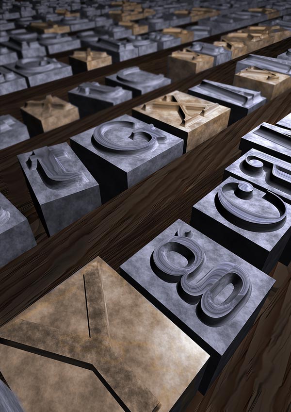
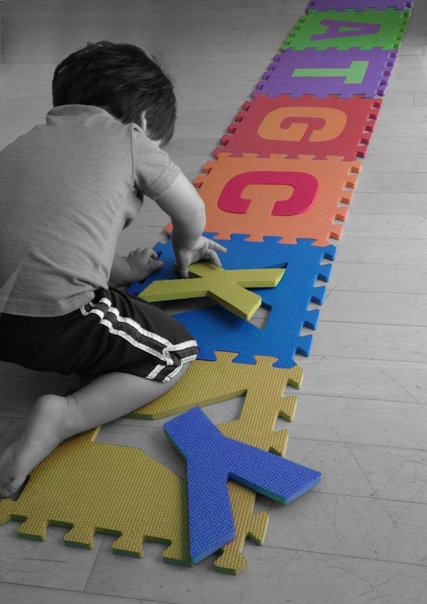
I had been hired to design candidate cover art for the issue of Nature that this paper came out in yesterday, but the project was halted when they realized that the paper was being fast-tracked and the cover had already been chosen. Nevertheless, the clients kept the drafts of the designs we had been working on, just in case they may come in handy for press coverage. The next thing I knew, my thumb was on BBC News, NPR's blog, and a handful (no pun intended) of other news sites as well. If you click on the image below, you'll see a gallery including the other two drafts. The printing blocks were a very rough draft, but got picked up by Live Science. Apparently no one wanted to use our favorite - an idea I had while hanging out with my two-year old. So while both he and I still remain relatively anonymous, my thumb is skyrocketing to superstardom. 

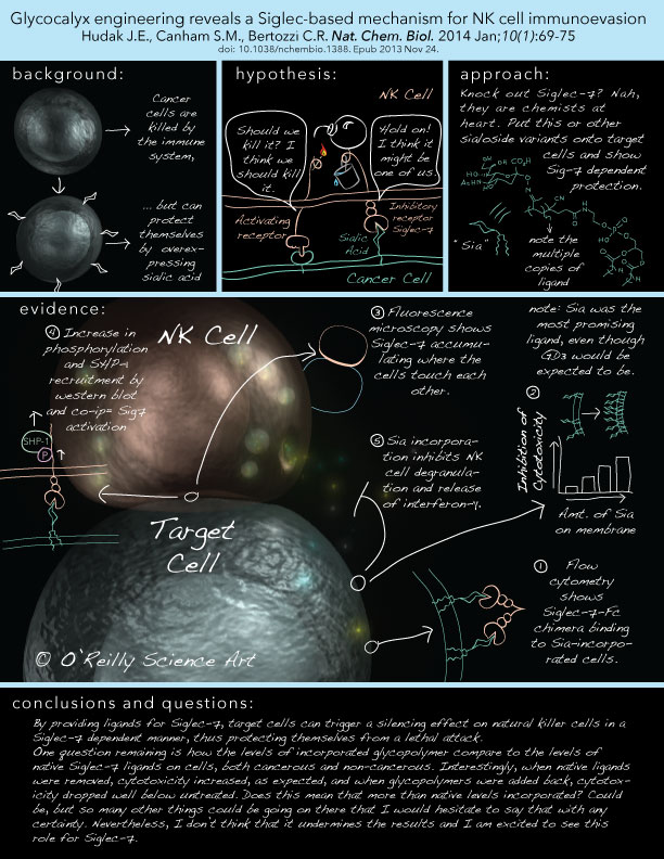
The inaugural Journal Club!

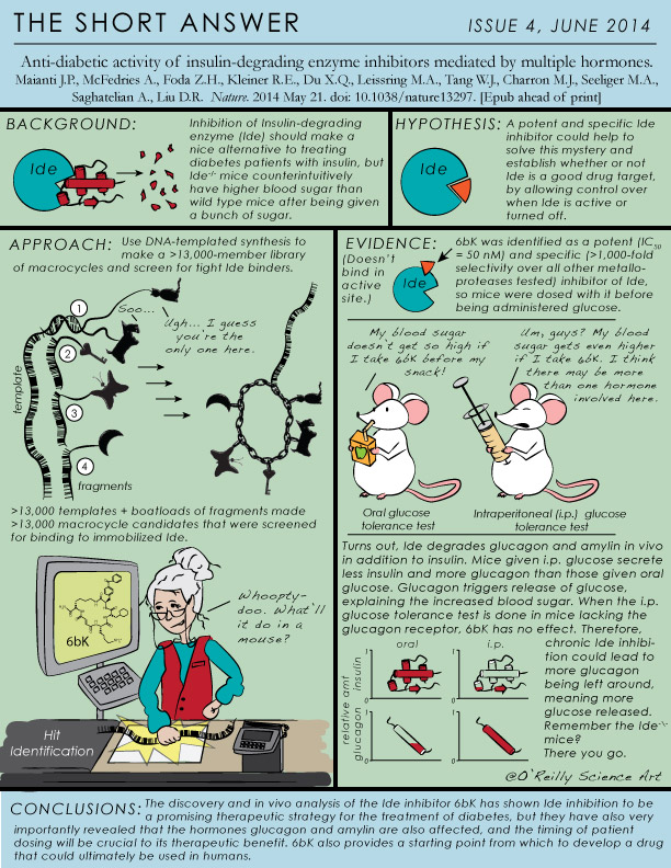
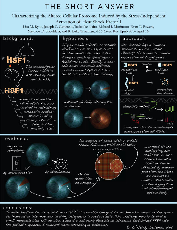
So I recently had this idea. Journals publish highlights as supplements to a few of their articles, and journals also display cover art. Highlights are wonderful, but still a time investment to read. Cover art is beautiful (and please keep giving me those projects because I love them) but their information content is somewhat limited. Maybe what's missing is something in between, not to replace either one, but as an additional tool for communication.  One aspect of working in a lab that I really miss is journal club, or getting together with lab mates to discuss recent papers. One person would present a paper and everyone would discuss its merits and pitfalls. The format I've adopted here is inspired by that idea, but because I've also challenged myself to keep it to an 8.5 x 11-in print size, the analysis necessarily takes a back seat to the summary.

Shown below is the inaugural journal club. To download a pdf for easier viewing, click here. I won't say much about the paper itself since the idea is for the image to stand alone, but the topic is near and dear to my heart since I worked on Siglecs during my postdoc, and glycobiology in general since graduate school. I won't always be so self-serving, but the topics will primarily come from chemical biology. 

My goal is to start out at once a month and then try to increase it to every other week if I can, because another one of the challenges is to choose brand new papers and get these illustrations out quickly. But let's say for starters I'll post them on the last Friday of each month. That sounds like a perfectly procrastinatory schedule that should suit me just fine. Let's just hope this doesn't end up like the time I tried to start doing pilates, or the time I tried to start learning Mandarin, or the time I tried to.....

Dream Job

It was with mixed emotion that I saw the completion of Behind the Scenes at MIT, a multi-year project whose goal it was to show undergraduates how the concepts they are learning are actually being applied to real research problems, and also to show the human side of research. Cathy Drennan, an HHMI professor and investigator in the departments of chemistry and biology at MIT, sought to create 2-3 minute videos in which researchers from graduate students to full professors describe their research to an undergraduate audience. These were accompanied by short personal videos with each researcher describing his or her background and what inspired them to choose their path. 

This is what my dream job looks like. First I was given the research video to watch, and then I created animations that would illustrate the research that was being described in words. Sometimes the producers would have an idea for an animation, and sometimes I was given carte blanche to come up with something. There are twelve research videos, and all told I think I made around 15-20 animations. Some of them can be found here on my website in the Flash animations portion of my portfolio, but all of them can be found embedded in their respective videos at http://chemvideos.mit.edu/all-videos/. I don't think I fully realized until the project was over how fortunate I was to work with such great people and to have a project of this scale that was both rewarding and fun. 

Here is former postdoc Sarah Bowman's research video. My animation comes in around 01:17 or so. I have a strong recollection of being very pregnant and moodily fighting with the flagella to get them to twirl just so. 

Happy New Year!

This year I resolve to get better at, and do more, 3D animations like the one below, which just came out as a supplement to a paper published in the January issue of the Journal of General Physiology

What I love most about animation is when a question arises in the making of one that gives the researchers pause, requiring them to think about the data in a way they hadn't before, or to take a deeper look at some aspect of their model. When you have to know not only how, but also when and where and in what order things happen, this can open up new questions and perhaps even spur future experiments. This functionality of illustration and animation doesn't get talked about as much as their important role in the communication of science, but perhaps it should. Many animators of science before me have figured this out, and are doing amazing things to pursue such avenues, including Janet Iwasa, Gaël McGill, and Graham Johnson, just to name a few. 


Nerdy nuptials

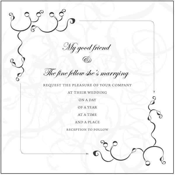
I'm eager to share a 3D animation that I recently finished, but I have to wait for it to be published. In the meantime, I am happy to share a wedding invitation that I designed for a friend and her intended, both of whom are scientists (some details have been removed to maintain their anonymity). It includes an X-ray crystal structure and a condensation reaction.

Here is how marriage is like a condensation reaction:

1. It doesn't always work.

2. There is a loss of (degrees of) freedom.

3. It can involve dehydration (primarily among the wedding attendees if there is an open bar).

4. It requires energy.

but more importantly, 

5. It can form a nice strong bond, and

6. The product can be much, much greater than the sum of its parts. 


In my experience, thermodynamics notwithstanding, I've found it to be quite favorable. 

One ring to transcribe them all...

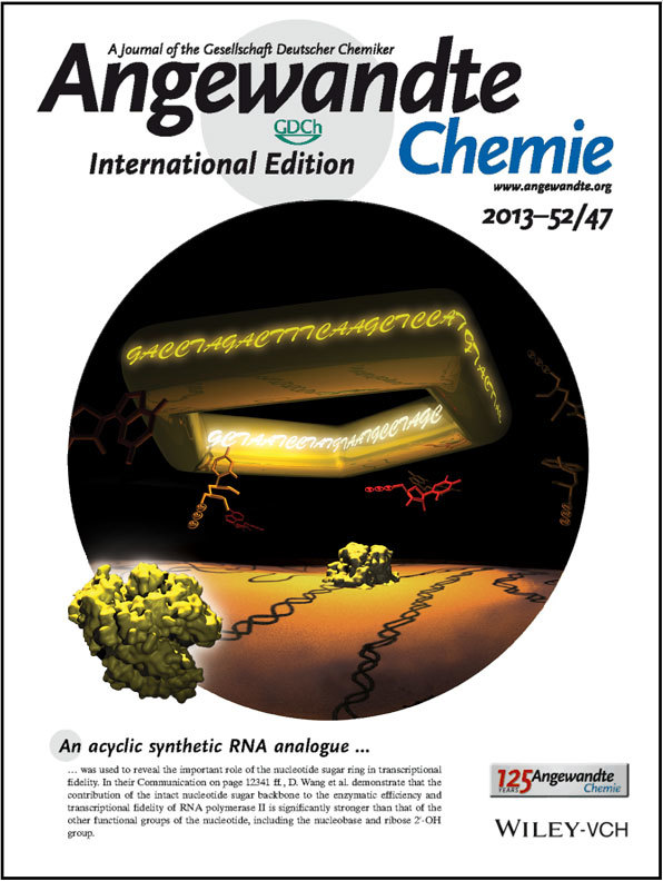
This just came out last week. It's a project I did with an old classmate of mine from MIT who showed how important the 5-membered ribose ring of the DNA sugar-phosphate backbone is for transcriptional fidelity. When they opened it, or unlocked it, as they describe, the polymerase no longer discriminated between different bases. It takes me back to the time as first year grad students when we built an enormous 3D model of DNA in JoAnne Stubbe's class. Good times. 

A Chemical Perspective on Transcriptional Fidelity: Dominant Contributions of Sugar Integrity Revealed by Unlocked Nucleic Acids

Liang Xu, Steven W. Plouffe, Jenny Chong, Jesper Wengel, Dong Wang. Angew. Chemie Int. Ed. Volume 52Issue 47pages 12341–12345November 18, 2013