If it's good enough for Norman
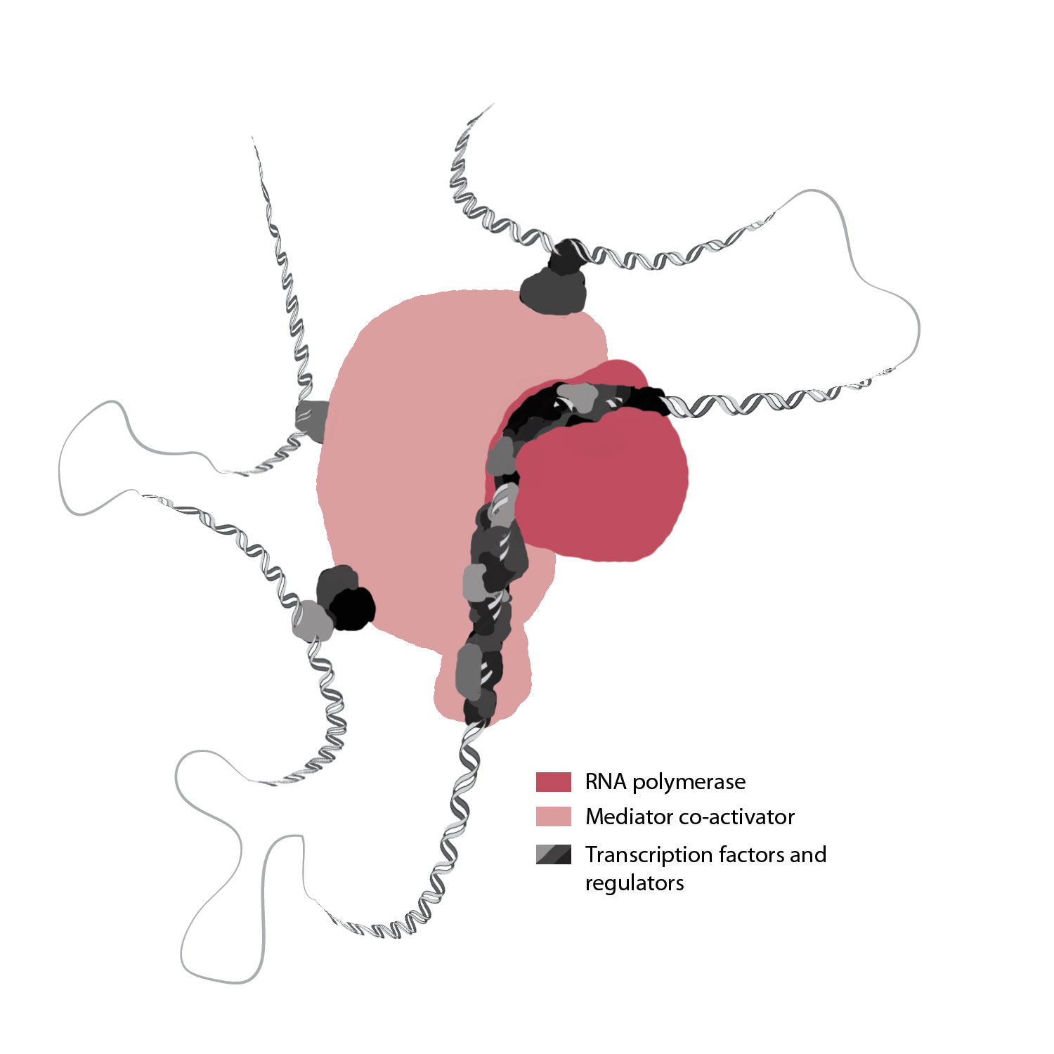
This is an early draft of an illustration I'm working on for a Systems Biology textbook. It is meant to very simply get the point across that transcription is way more complicated in eukaryotes than in prokaryotes (the distinction is made from the previous figure in the book). One of the challenges of doing these illustrations is that the book will be printed in duotone, which means grayscale plus one color - that color being a particular shade of red that was specified by the publisher. The lighter pink that you see is just a partially transparent version of the red, a trick to get more colors out by taking advantage of the value range.
If I thought at first that this seemed restrictive, I quickly remembered that from the time of Norman Rockwell's inaugural Saturday Evening Post cover in 1916 until 1926, when the Post printed their first color cover, he had to do all of his covers in duotone, also relying on a specific shade of red. Sure, he didn't have to distinguish different classes of biomolecules from one another or try to make sense of hulking multi-protein complexes, but how frustrating it must have been for him as a painter. I used to live in Massachusetts and I visited his well-preserved studio in Stockbridge. I stood in the spot where many a model stood for him, a perfectly northern-lit space that ensured that the colors changed as little as possible as the sun moved through the sky. A fat lot of good that did him while every tube of paint but red, white and black must have sat gathering dust in the back. Obviously I can't compare my work to Normal Rockwell's, but I can draw a lot of inspiration from his gorgeous use of duotone and his uncanny talent to tell an entire story with a single image.