Three years ago I started teaching chemistry as an adjunct while I built the illustration business. It was the perfect complement and I found each career enhancing the other. But it finally got to the point at which I didn't feel like I was improving any more at either of them. I was just trying to keep my head above water. It was time. After mourning a little bit the close to a very rewarding chapter of my life and then getting over the "holy paycheck and benefits what have I done" moment, I got really excited. I'm fortunate to have some outstanding clients to work with, but I'm going to need to grow that list a little, so it's time to do some real old-fashioned advertising! Here is a discarded prototype of a mailer I designed. Now I'm going to get to work on the design that I finally settled on.

Good news!
On top of the fact that I just launched this shiny new website, I found out that I got my clients a cover with this illustration. More details after the issue comes out.
Kill your darlings
This is usually a term that writers use and it means that you shouldn't settle for something even if you think it's good. You should throw it away and write something better. In my latest logo design project, I had to kill a couple of darlings, but it was totally worth it (I think that's the point). I also really enjoyed working as a team with these clients.
The project started with some brainstorming. At this stage the clients were considering embedding the logo into the name of the company.

Some of the ideas in these doodles come from the fact that the company is focused on translation, and how small biochemical perturbations can have a ripple effect on the entire process. After talking some, it was decided to separate the name from the logo, but the option of incorporating the "e" was left open because of the distinctive way in which the name of the company starts with a lowercase "e" and has the rest of the letters in capitals. Another key feature was highlighting the fact that synthetic chemistry is a large part of their strategy.
So then, I thought I had it:
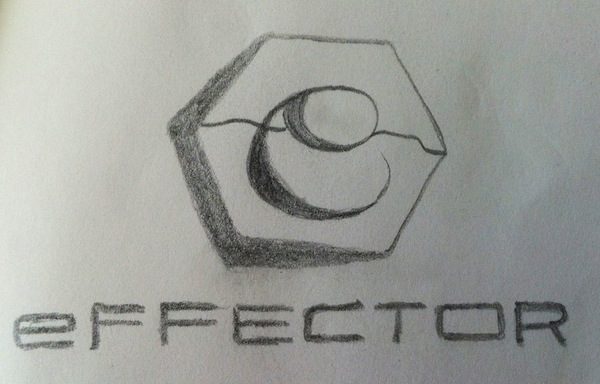
That was the first darling that I killed. Then, after a discussion in which the ideas of ribbons and even mobius strips were being batted around, came this:
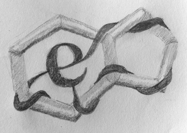
But we all agreed that this was, as one member of the company put it, a little too "gothic". Fair enough. Dead.
So then I had this idea while driving and only spent about 10 minutes of actual billable time sketching it out. I thought that this was a good way to combine the chemistry and the translation (ribosome) into one very simple image. I was pretty excited about this one at first.
But I killed it too.
In the end we decided to go with a design in which cleverness took a back seat to coolness. Which is really the best way to go, since you want everyone to think it looks cool even if they don't "get it". And what we ended up with is simpler, cooler, and better. The colors are still being tweaked ever so slightly but this is basically it, and there is no mourning of the dead darlings.

A premature digital sketch

For this project, a website graphic for a biotech company's homepage, I needed to get a draft made in 3 hours or less total. Because I didn't think a pencil sketch would give them a very good idea of what the final product would look like, I had to move to the computer pretty quickly after a few cursory thumbnails on paper. So I wound up with something that looks like it could be a finished product, but a rather poor one, since both the composition and colors need some work. So now my sketchbook is like, "See? I told you so." And it's right. But the clients know that this is just a "sketch" so it's okay. I'll probably go back to the sketchbook before moving on with it. That is, if it'll have me.
Happy Anniversary, sketch blog.
Three years ago today I posted my first entry to this blog. I was still a post doc then and would soon accept a position to teach chemistry at the University of San Diego in the fall as an adjunct while I got my illustration business off the ground. I'm pretty sure that the gift for 3rd anniversaries is a logo, so that's what I went with. Here's a sketch of the design I came up with. I'm replacing my original logo, which is based on the red dye molecule that makes alizarin crimson (but why would anyone know that, unless you happen to be one of those scientists you see on Nova who use IR to analyze old Rennaissance paintings?). I like this new one better and I hope you do too.

This one's for you, J.J Thompson
This interactive animation is a work-in-progress. So far it illustrates how the electron was discovered using a vacuum tube. By the end it will go on to show how the mass/charge ratio of an electron was found.
Some RNA polymerases, just for fun

My first interactive animation!
Move over angry birds. This thing's going viral. Just a draft for now. There is at least one mistake (an unresponsive button on one frame). Can you find it? (Note: the animation may take a few seconds to load)
Enantiomeric perplexcess
syrb2v1 from Mary O'Reilly on Vimeo.
The last video I posted described antibiotic resistance and the proliferation of antibiotic-resistance bacteria, and is the first in a series of three animations that accompany a video describing a post doc's work on a threonine halogenating enzyme. This animation is the third in the series, so the bomb at the end won't make sense until the second one is complete. Once threonine is halogenated, it gets incorporated into an antibiotic via a non-ribosomal peptide synthetase. The electronegativity of the chlorine activates the adjacent carbon and it is thought that this enhanced reactivity plays a role in the toxicity of the molecule. That is why the carbon is blinking. Subtle, I know. But the only real hiccup I had with this animation so far was when I realized that I had drawn the enantiomer of threonine in my prototype. Not even just a diastereomer, no, the complete enantiomer. My students would be so disappointed if they knew.
A legit draft
antibioticresistancev2 from Mary O'Reilly on Vimeo.
Here's a more complete draft of this animation about antibiotic resistance for an undergraduate chemistry audience. Obviously still a few gremlins to work out but it was ready to send to the clients. There's no point making the client pay for polishing if there are major revisions in store. This was done in Flash. I'm going to miss you, Flash.
A 5-second trailer
antibioticresistancedraft1 from Mary O'Reilly on Vimeo.
Here is a preview of an animation I'm working on for the HHMI-MIT video series that I've been involved in for the past year or so. There'll be three animations for this particular video, and this first animation is meant to show how even though humans are smart and can design potent antibiotics, the bugs outsmart us and develop resistance. I still need to wipe out the rest of the colony and then re-populate it starting with division of the antibiotic-resistant cell. I should say that the mechanism of resistance is a tad more complicated than the bacterium breaking the arrow over its proverbial knee, but I would need at least one more full animation to do it justice, and that's not really what the video is about. Stay tuned to find out what that is.
More storyboarding
This one's simpler than the last storyboard so not nearly as torturous. And it's fun to use my sketch book for more than thumbnails sometimes. Now I need to turn these into an animation using Adobe's new HTML5 program Edge Animate. I'm not an early adopter, so it's been interesting for me to navigate this program which has very little support, but it's good for me. Between a one-month subscription to lynda.com, which has very brief training in it, and some online tutorials, I've managed to learn how to use it. I just have to keep reminding myself that someday I'll be as comfortable with it as I am with Flash. And hope that Adobe doesn't pull it right when I get to that point.

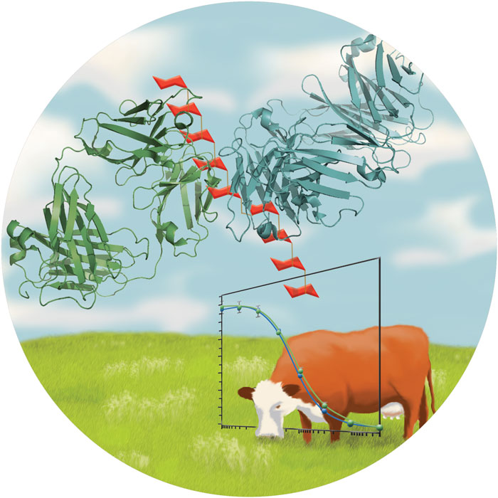
Got the cover!
Congratulations Weerapana lab and thanks for the great project!

Goofing around
I'm not sure at what point I thought this might be a viable option for cover art, but luckily I caught myself shortly after the brainstorm. The journal in question does often have cartoons on the cover that can be goofy, but this is a serious stretch. It's obviously a work-in-progress. The client liked it and wants to use it on the lab website, which is why I am finishing it. The sulfonyl fluoride molecule is a covalent activity-based inhibitor with great selectivity for a certain class of hydrolases.

Late light bulb shines in vain
This happens to me a lot. I come up with the perfect birthday present for someone the day before their birthday even though I've been brainstorming for weeks. I spend hours the night before class preparing my lecture but can only see exactly how best to explain a concept 5 minutes before class starts. This doesn't often happen in my illustration work, but it just did. I was tasked with coming up with cover art from scratch in under two weeks, and given free reign to conceptualize the paper. It's certainly not a demanding or even unusual timeline, it just doesn't leave as much time for brainstorming. Yesterday I submitted the image below, which I'm perfectly happy with, but today, a day before the deadline, I come up with a way better idea. Now I'm kicking myself, or at least whatever mysterious part of myself produces ideas whenever it feels like it and too often not when I'm trying really hard to make it do so. I'll just have to keep the idea in my back pocket for now.

Panel unanimously concludes that storyboarding constitutes torture
I just want to get to the animating!

Four stages of tumor progression project done!

Here is the cover of the brochure for which my four stages of tumor development illustrations were made. They appear separately within the brochure, but the designers also used them as a design element on the cover they designed. I'm not sure if they meant for the man to have his mouth agape in mock horror or if the cell just happens to be there. Either way, I love the design. Now I want to place all of my artwork nestled inside a DaVinci man silhouette like this one. But I will refrain. I guess.
How very European of me
That's right, I took the month of August off from updating my website. No, I didn't spend it on an island in the Mediterranean. I couldn't share one of the projects I was working on due to a confidentiality agreement, but of course that doesn't account for an entire month. Here's what else I did on my August vacation. I taught 17 undergraduates how to derive the rate law for the reaction between bleach and blue food coloring and how to tell the difference between plaster of paris, chalk, and baking soda in the lab. I learned how to make interactive animations using Adobe Edge (the Apple device-friendly follow-up to Flash) for a textbook project I'm working on. I drove to Lake Tahoe and back with the husband and our 9 month old force of nature. And most recently, I put together the figure below (a draft) for a bioinformaticist who is seeking ways to engineer a synthetic organism with a minimal genome. To this end, his group has explored the possibility of creating a genome that only uses 19 amino acids instead of 20. This figure describes their efforts to do without cysteine residues. Turns out there are a small handful of cysteines whose chemistry is just too important to be removed or replaced by something else. The PI behind this work was inspired by a lipogram which was a rewriting of Edgar Allen Poe's "The Raven" that completely lacked the letter "e". It's called "Black Bird". People in the biz are always looking for examples of science being inspired by art, and I think this is a particularly interesting one.

No animals were harmed in the making of this illustration

For a project I'm currently working on, I needed to draw a mouse with a tumor. In doing this, I came across a neat trick for depicting fur. In Photoshop, you just go to the Filter menu and choose Noise -> Add noise, and go to about 10%. Then, add a motion blur from the same Filter menu. It's not the most realistic but I think it's not bad for a mouse that is just a part of a larger illustration and partially obscured by a Kaplan-Meier plot.
A quick Saturday afternoon animation
methylationanimationv3 from Mary O'Reilly on Vimeo.
This was a fun project made very easy by the fact the client had already picked out the colors and shapes. I just had to draw them and make them boogie. Her lab recently published a paper on the structure of a protein complex that undergoes some fancy gymnastics to perform methylation chemistry, and she just wanted something fun to show at the end of talks. Of course the structures themselves are much more beautiful, but the crowd will have gotten a nice eye-full by the end, and this helps to actually see what's going on. While I worked on this, our own little gymnast was keeping the husband on his toes. I guess I always knew that babies are strong and fearless, but I had no idea that they are so lightning fast too. It's a portentous trifecta and we're just trying to keep up.