Passing the boron

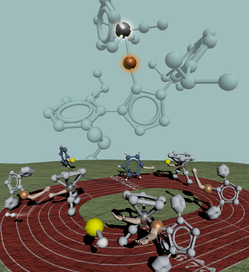
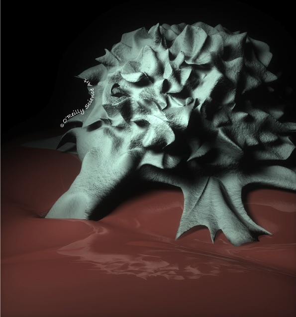
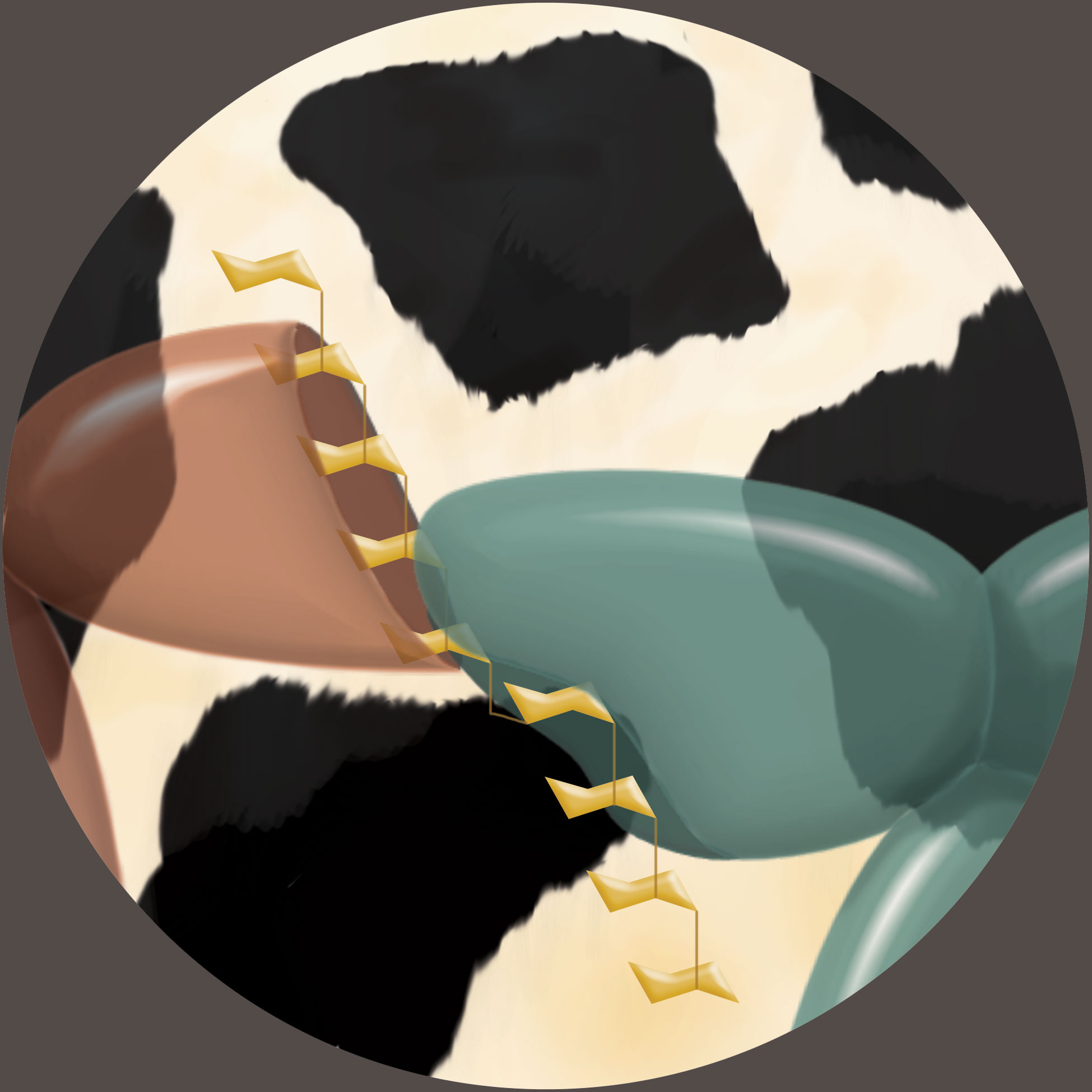
I'm working on a new project that is, again, super secret until publication, but I can show this "old" one now, the teaser for which I posted last. The bimetallic catalyst shown at the top is capable of efficiently borylating aryl groups as demonstrated in this relay. First the catalyst breaks the B-H bond and breaks apart itself. The yellow boron (attached to hidden "R" groups) then gets traded for a H with benzene. As the borylated benzene leaves the track, the two halves of the catalyst, both now toting H's, come together to reform their bond and make diatomic hydrogen in the process.  

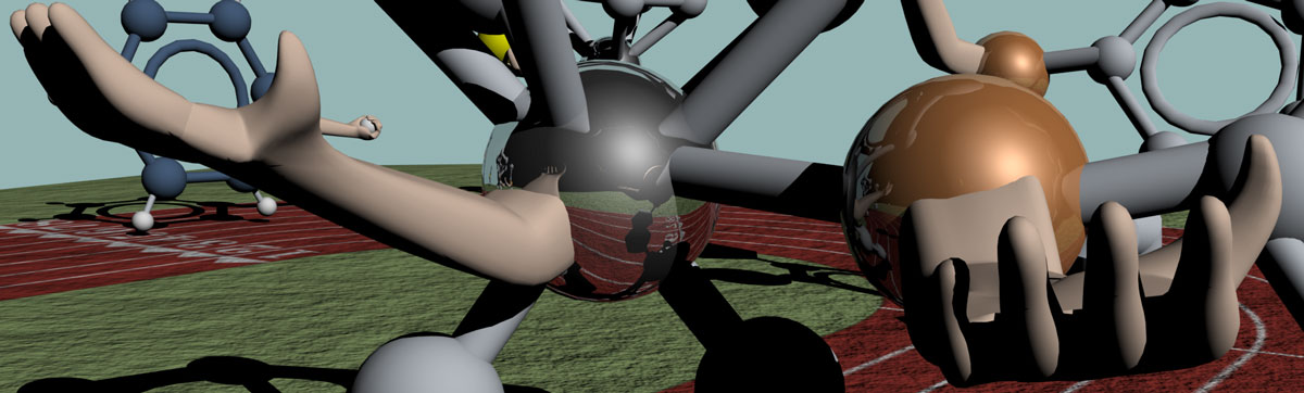
As a footnote let me add that atoms do not have arms. They have electrons. Which means that you cannot know both the position and momentum of the arms in this illustration. Which is a lot like how I dance. 

A teaser...

I can't say much about this yet, but the complete image, from which this slice was taken, is yet another cover art candidate.  That makes three that I'm awaiting decisions from editors on. I'm running out of fingers to cross. 

Another project under wraps

I've just finished another cover art piece, and like the previous project, the client has asked me to keep it to myself for a bit, this time just until the paper comes out. So for now I'll share another of my free-time creative endeavors. 

These are potential logos for my son's babysitter's photography business. She will pay in babysitting hours, thus enabling a nice long afternoon birthday brewery tasting tour for the hubs. Here in San Diego you can't throw your surfwax without hitting a craft brewery, so it was easy to find a rash of excellent tasting rooms to sample that are not too far from us. As much as I miss the east, it is hard to complain about living here (and rightfully so, no one would listen if I did). 

Back to basics

Over the past week I created two images for a new client who is applying for academic jobs this fall. 'Tis the season! The illustrations are for his original research proposals, and though I didn't have to sign a CDA, he doesn't really want the ideas getting out there. It of course flattered me that he thought that my readership is such that this might be a concern, but you just never know. So I'll hold off on posting them anywhere until he deems it safe and I'll share a couple of drawings I did over the past week instead. 

No matter where I am in my career I will always periodically go back and tune up my drawing skills. Over the past few years my nights have been consumed with preparing chemistry lectures and grading never ending piles of exams and quizzes. Now that I have my nights back again I've been stepping away from the computer more and more. I just learned this method of sharpening charcoal pencils with a razor blade from Jeffrey Watts of Watts Atelier in San Diego. It is an art form unto itself and if you look closely you'll see my technique still leaves a lot to be desired. But I was inspired to give it a try and so I grabbed a few nice geometrical objects from around the house to draw. I stole some toys from my son and dug up this old mannequin, then settled into the garage (which ironically has the best lighting) with a podcast and a couple of albums from The Walkmen. Now that football is back I don't think that I was too terribly missed. And it's nice to be getting my hands dirty again.

If it's good enough for Norman

This is an early draft of an illustration I'm working on for a Systems Biology textbook. It is meant to very simply get the point across that transcription is way more complicated in eukaryotes than in prokaryotes (the distinction is made from the previous figure in the book). One of the challenges of doing these illustrations is that the book will be printed in duotone, which means grayscale plus one color - that color being a particular shade of red that was specified by the publisher. The lighter pink that you see is just a partially transparent version of the red, a trick to get more colors out by taking advantage of the value range.  

If I thought at first that this seemed restrictive, I quickly remembered that from the time of Norman Rockwell's inaugural Saturday Evening Post cover in 1916 until 1926, when the Post printed their first color cover, he had to do all of his covers in duotone, also relying on a specific shade of red. Sure, he didn't have to distinguish different classes of biomolecules from one another or try to make sense of hulking multi-protein complexes, but how frustrating it must have been for him as a painter. I used to live in Massachusetts and I visited his well-preserved studio in Stockbridge. I stood in the spot where many a model stood for him, a perfectly northern-lit space that ensured that the colors changed as little as possible as the sun moved through the sky. A fat lot of good that did him while every tube of paint but red, white and black must have sat gathering dust in the back. Obviously I can't compare my work to Normal Rockwell's, but I can draw a lot of inspiration from his gorgeous use of duotone and his uncanny talent to tell an entire story with a single image. 

Up and running with Maya!

So I finally got around to purchasing and learning how to use Maya, the 3D modeling and animation software that is also used in gaming and many animated and CG-laden Hollywood movies. It's been widely adopted by science illustrators and animators, which made it an easy choice because there are some fantastic tutorials available for importing X-ray crystal structures from the PDB, not to mention many other tutorials that are specific to cellular and molecular processes. 

Not long after, I was commissioned to create cover art for a journal that always has exquisitely beautiful covers. No metaphorical cartoons cutting it here. I knew I had to do something really striking, so I was relieved that I had added Maya to my skill set just in time. The paper is about the discovery of a link between a specific gene and the invasiveness of certain cancer cells, so I decided on a close-up of a metastasizing cancer cell invading neighboring tissue. Now, with this kind of ridiculously complicated (for a newbie) modeling project under my belt, I feel pretty comfortable with the software, even though I know I've only just scratched the surface.  Animation, I'm coming for you next. 

We are still waiting for a decision on the journal cover, but in the meantime it is being used by a couple of university news outlets.  I'll post the original reference once the issue is out.

Pretty excited about my new business cards

By a complete coincidence I stumbled upon this husband-wife duo (Byvik Ink, even love the name) who runs a 19th century letterpress out of their garage. Then I realized that they are in the San Diego area. Done. And as it turns out, really lovely people. So here is one of the cards, which were printed on 100# Speckletone Starch White paper from French Paper (which, despite the name, is in Michigan). They feel amazing and the embossment makes them seem like they are from another time. Love them. I don't know if I can give them away. It's a good thing I got 250.

Not my first rodeo

Okay, this isn't a rodeo, and furthermore, if it was, it would most certainly be my first. But this is the title that got stuck in my head for the draft below which follows from the last post.  

torerodraft.jpg

The trail of inspiration that led to the bullring

Just because I'm not a natural science illustrator (by that I mean an illustrator of natural science, not a science illustrator who comes by it naturally, which I like to think I am) doesn't mean I'm never inspired by macroscopic nature. A while ago on a trip with our son to the San Diego Zoo, I saw a spiral-horned antelope for the first time, and I had a feeling that I was going to want to invoke this beautiful helical-headed beast at some point. Months later, it popped into my head when I was tasked with creating cover art to highlight a technology in which peptides are conjugated with relatively short strands of polyethylene glycol (PEG) to increase their half-life intracellularly. Adding PEG to increase the half-life of proteins is common enough, but part of what sets this work apart is that exactly two chains are added to the peptide, and they are smaller than the peptide itself. Once on, they protect the peptide from proteases that will mercilessly destroy them should the peptide happen to get in their way (see the animal stampede in the distance?). But I wasn't reminded of the antelope until I was doing a little reading about the structure of PEG for this project, and learned that it takes on a somewhat helical structure in solution. From there, the rest of the analogy fell into place. That said, what this sketch did was to spark an idea in the client's mind to swap the antelope for a bull chasing a matador (the target of the peptide) while itself being chased by picadors (proteases). Which means I can keep the antelope in my back pocket for a little while longer! 

In a world, where camaraderie is your only hope...

One is from a small liberal arts college, the other is from Harvard. This summer, these two interns will find out that the crushing disappointment of failed experiments slowly eroding an already fragile self-worth is the one true equalizing force in the beautiful and mysterious world of research.

Or at least, that might be the trailer if this were a movie. It is not. This is a draft of an illustration to accompany a scientist training course on diversity and stereotype threat. The part about their college backgrounds is true. This illustration was a fun trip down memory lane, conjuring up some of the items I might have found on my own bench at any given time (if only it were ever that neat). 

Gooooooooooaaaaaaaaaaaaal!

Here's another design that I just found out made a journal cover. It's about a chemical linker that brings together two building blocks using two different types of well-established chemistries. The client started with the idea of a picture of the two scientists credited with these strategies holding hands, but didn't want them to necessarily be recognizable as themselves. So first I had the idea of the somewhat cliché silhouette of two people walking on a beach at sunset, both holding hands with a very small child between them. The child would represent the linker but also the "brainchild" of these two scientists. What it evolved to is below. The clients suggested using t-shirts that somehow advertise the names of the scientists, so then I thought, why not soccer jerseys. Then the numbers could represent the order of the steps in the synthetic scheme. Now, I won't lie. I knew this idea would kill. My clients are German. Was I pandering? Maybe. I even considered referring to them as football jerseys but realized that they would probably just be confused as to which sport I was referring to. Anyway, it did kill, and it no longer made any sense at all to have a child between them, hence the trophy. I was instructed on the colors of the jerseys as they are relevant to recent happenings in the German soccer world. And the "immobilization" of blades of grass highlights one of the applications of the linker. I'll give more details about where this is once the paper comes out.

Moo

This week's issue of Angewandte! This is the back cover. The front cover was created for the authors of another article by what seems to be a very sophisticated design firm in Berlin, but since their site is in German I wasn't able to learn much about them.  Nevertheless, I enjoyed browsing their werke, in particular the anatomische illustration. Ich bin lost after that. 

Just to show you how much a project can evolve even when the authors start with a fairly good idea of what they want, here was the first draft of this project. It was a pleasure working together with them through various ideas.

A nice niche for myself?

When I explain to people what I do, they often point out how niche it is, which is true, sort of. Here are a few in-progress projects that I've been working on this week. From a signaling pathway for a systems biology textbook to illustrations to accompany a training program on stereotype threat for scientists, I think it's safe to say that while, yes, I've found a nice little niche for myself, I don't think I've exactly typecast myself yet. 

Come on baby like my flyer

It's not always easy working largely in isolation as a freelancer, but I do bounce a lot of ideas off the ol' hubs. With the heart of a scientist and the keen eye of a designer, I really value his opinion. I find that when I am doing work for myself, as in the ad campaign I'm working on, I won't quit until I come up with something that passes his scrutiny. I simply ask him to answer: a) Yes! (the exclamation point is key), b) No, or c) Maybe, with revision (though I always get more feedback than this). 

It wasn't easy, but I finally got an "a)" with this design: 

I did it. I quit my day job.

Three years ago I started teaching chemistry as an adjunct while I built the illustration business. It was the perfect complement and I found each career enhancing the other. But it finally got to the point at which I didn't feel like I was improving any more at either of them. I was just trying to keep my head above water. It was time. After mourning a little bit the close to a very rewarding chapter of my life and then getting over the "holy paycheck and benefits what have I done" moment, I got really excited. I'm fortunate to have some outstanding clients to work with, but I'm going to need to grow that list a little, so it's time to do some real old-fashioned advertising! Here is a discarded prototype of a mailer I designed. Now I'm going to get to work on the design that I finally settled on.  

Good news!

On top of the fact that I just launched this shiny new website, I found out that I got my clients a cover with this illustration. More details after the issue comes out. 

Kill your darlings

This is usually a term that writers use and it means that you shouldn't settle for something even if you think it's good. You should throw it away and write something better. In my latest logo design project, I had to kill a couple of darlings, but it was totally worth it (I think that's the point). I also really enjoyed working as a team with these clients.

The project started with some brainstorming. At this stage the clients were considering embedding the logo into the name of the company.


Some of the ideas in these doodles come from the fact that the company is focused on translation, and how small biochemical perturbations can have a ripple effect on the entire process. After talking some, it was decided to separate the name from the logo, but the option of incorporating the "e" was left open because of the distinctive way in which the name of the company starts with a lowercase "e" and has the rest of the letters in capitals. Another key feature was highlighting the fact that synthetic chemistry is a large part of their strategy.

So then, I thought I had it:

That was the first darling that I killed. Then, after a discussion in which the ideas of ribbons and even mobius strips were being batted around, came this:

But we all agreed that this was, as one member of the company put it, a little too "gothic". Fair enough. Dead.

So then I had this idea while driving and only spent about 10 minutes of actual billable time sketching it out. I thought that this was a good way to combine the chemistry and the translation (ribosome) into one very simple image. I was pretty excited about this one at first.

But I killed it too.  

In the end we decided to go with a design in which cleverness took a back seat to coolness. Which is really the best way to go, since you want everyone to think it looks cool even if they don't "get it". And what we ended up with is simpler, cooler, and better. The colors are still being tweaked ever so slightly but this is basically it, and there is no mourning of the dead darlings.


A premature digital sketch

For this project, a website graphic for a biotech company's homepage, I needed to get a draft made in 3 hours or less total. Because I didn't think a pencil sketch would give them a very good idea of what the final product would look like, I had to move to the computer pretty quickly after a few cursory thumbnails on paper. So I wound up with something that looks like it could be a finished product, but a rather poor one, since both the composition and colors need some work. So now my sketchbook is like, "See? I told you so." And it's right. But the clients know that this is just a "sketch" so it's okay. I'll probably go back to the sketchbook before moving on with it. That is, if it'll have me.  


Happy Anniversary, sketch blog.

Three years ago today I posted my first entry to this blog. I was still a post doc then and would soon accept a position to teach chemistry at the University of San Diego in the fall as an adjunct while I got my illustration business off the ground. I'm pretty sure that the gift for 3rd anniversaries is a logo, so that's what I went with. Here's a sketch of the design I came up with. I'm replacing my original logo, which is based on the red dye molecule that makes alizarin crimson (but why would anyone know that, unless you happen to be one of those scientists you see on Nova who use IR to analyze old Rennaissance paintings?).  I like this new one better and I hope you do too. 

sketch040813.JPG

This one's for you, J.J Thompson

This interactive animation is a work-in-progress. So far it illustrates how the electron was discovered using a vacuum tube. By the end it will go on to show how the mass/charge ratio of an electron was found.