Anderson Lab feature article gets the cover
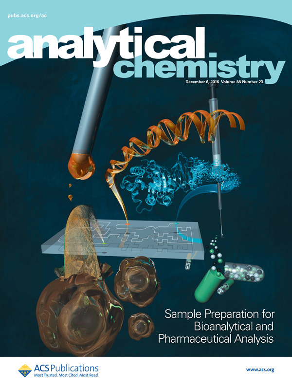
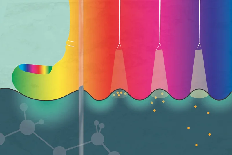
This cover that I made for Jared Anderson's group at Iowa State University just came out. It highlights a feature article they wrote about sample preparation for bioanalytical and pharmaceutical analysis. I learned that we've come a long way from phenol-chloroform extractions as the main way we get DNA from cells. For anyone who knows anything about this, I am dating myself, but the first experiment I ever did in a non-classroom laboratory started with doing mini-preps using phenol-chloroform extraction. By the time I got to grad school we used these adorable little centrifuge tubes equipped with filters to do mini-preps, and you could finish one before your coffee got cold on your desk. Now they're using microfluidics to separate DNA from proteins and other flotsam and jetsam. I know very little about microfluidics, but I am always reminded of a seminar I saw over a decade ago at MIT from an up and coming Rustem Ismagilov, a professor at CalTech. It was common for researchers to photograph their microfluidic devices next to a penny to demonstrate the impossibly small size they were able to achieve. Professor Ismagilov told us how, as he embarked on this field of research, the first thing he did was to go out and get a really really big penny. Maybe the funniest thing I've ever heard in a seminar.
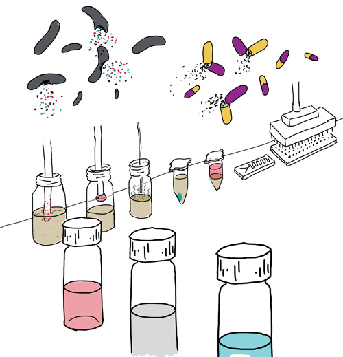
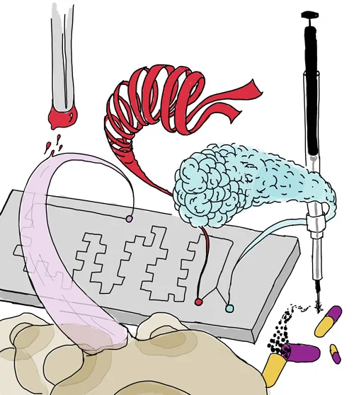
Below are the sketches I presented to the Anderson Lab for consideration. They discuss many techniques in the paper (magnetic ionic liquids, solid phase extraction, etc.) so it was a challenge to try to work in as many as I could. They chose the second sketch. I don't know the reason, but maybe having the bacteria and pills looking like so many college freshman was a bit much.
Weerapana Lab website gets a long overdue upgrade
When my good pal Eranthie started her lab in Boston College's chemistry department, I illustrated a home page image for her (below). It lived there for 6 years.
It's pretty generic and outdated, way too superhero comic-y, and frankly I generally don't like to look at anything I made that long ago. But because she is way too loyal I knew she would never change it unless I made something to replace it. So as a gift to congratulate her on getting tenure, I came up with three new designs. Her students voted and chose the one below. I like it now but I'm sure I'll be ashamed to look at it by the time she gets promoted to full professor. At least I hope so.
A throwback in honor of the 2016 Nobel Prize in Chemistry
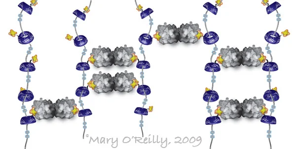
When I was a postdoc in Jim Paulson's lab studying multivalency in protein-carbohydrate interactions, I was invited to the Frie Universitat in Berlin to give two talks, one about multivalency in nature and chemical methods to mimic it, and one specific to my own research. I made the illustration below for the former, to describe a self-assembled pseudopolyrotaxane, often described as the molecular equivalent of beads on a string. It was developed in the lab of Fraser Stoddard, one of the three winners of the Nobel Prize in Chemistry that was just announced. In this collaboration with Linda Baum's group, they built a scaffold of the pseudopolyrotaxane that multivalently displayed a carbohydrate ligand (in yellow), and precipitated its dimeric cognate lectin, galectin (in gray), by forming cross-links like you see in the illustration. The circles you see in between the "beads" are positive charges that act as speed bumps, to stall the beads from just falling off of the string. I remember thinking that this was incredibly cool, and in retrospect apparently just the kind of ingenuity that puts you in line for a Nobel Prize. Looking back on this illustration reminds me of how immensely satisfying I found it to create all of these new illustrations for my talks. I was just on the cusp of letting go of the idea of an academic career in favor of, for lack of a less cliché phrase, following my dream. But at the time I was my only client, and I didn't pay well. Somehow I didn't enjoy it any less.
Transcription factors: the high school guidance counselors of the cells
I was commissioned by the DeVal Lab at the Ludwig Institute in Oxford to create this little animation that explains very simply for a general audience how different transcription factors trigger cells to become either arterial or venous cells. The lab was an absolute dream to work with and the animation has been a lot of fun to make. And how lovely is it with the British-accented voiceover done by the client? People pay good money for that here!
After 2 years of Short Answers for my own amusement, a real comics commission
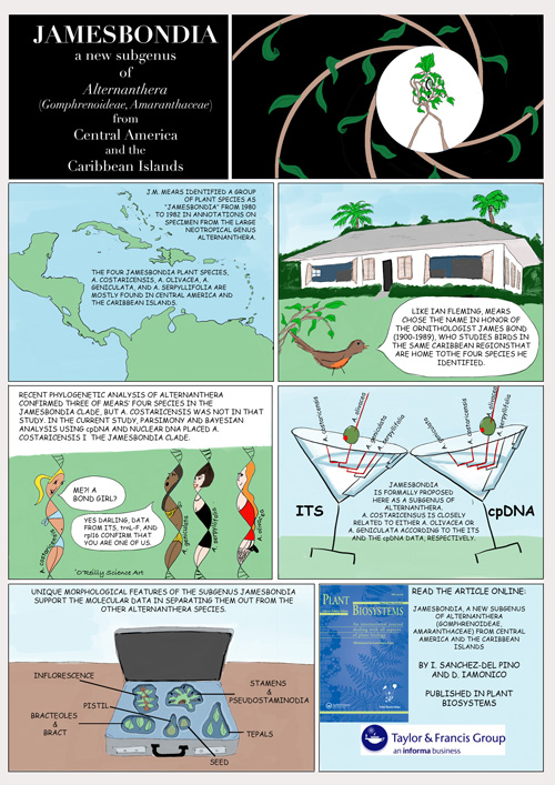
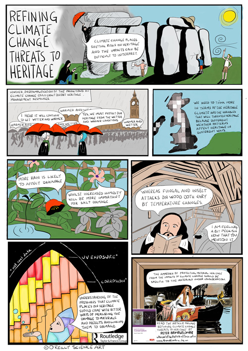
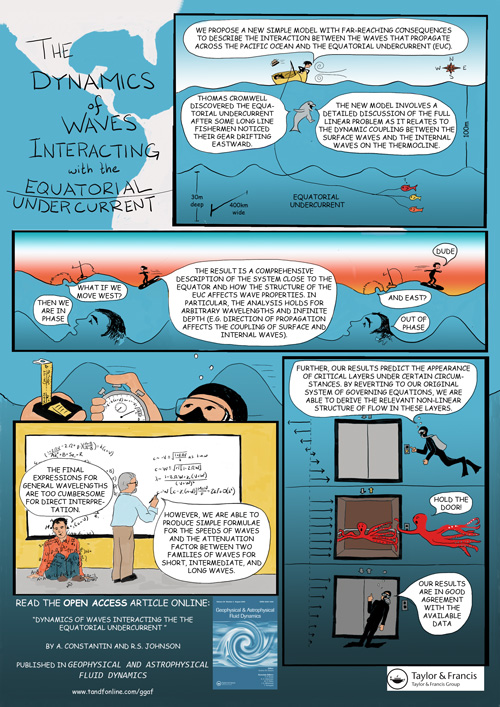
As I mentioned in my May 6th post, I was commissioned by the publisher Taylor & Francis to contribute to their cartoon abstracts project. The comics I made are all online now so I can share with you the three I did. For the most part I was provided with the text, but I still found myself doing tons of research to figure out what to draw. I made all of these on my new iPad Pro with Apple pencil using the suggestively named software known as Procreate. (It should go without saying that no one is paying me for mentioning any of this.) Anyway, it was nice to be untethered from my desktop behemoth for a while to do these but now I'm back in the office with a series of new projects, all of which are figures for publication. I am wondering whether this has any correlation to the recent article in Nature Careers (HERE) that extolled the virtues of hiring a professional for one's scientific figures and used examples of several science illustrators, including myself. If so, thanks Nature!
If you want to see more cartoon abstracts, presumably done by artists with much more cartooning experience than me, you can find them all HERE.
DUBs for the win
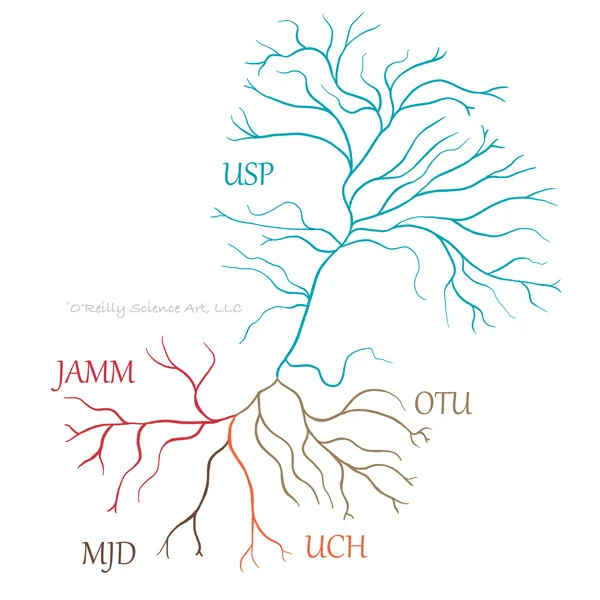
Here's a little dendrogram of de-ubiquitinases (aka DUBs) that I stylized for a client. Less than a week went by between receiving the e-mail requesting the artwork and getting paid for said artwork, making this project the new record-holder.
Landed a landing page for Salgomed, Inc.
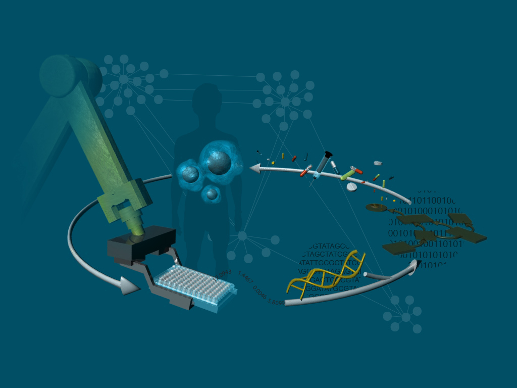
It is actually pretty rare that I work with labs that are local, so it's always a pleasure when I can meet with clients in person. This image was made for the San Diego biotech company Salgomed, Inc., but I met with the CEO in his office at The Sanford-Burnham Prebys Medical Discovery Institute where I was treated to a Nespresso and a lovely conversation about their work. They have developed an algorithm that takes assay data, generated in their own lab, and makes predictions about drug combinations that will effectively treat certain cancers. Those combinations go back into assays and this iterative process leads to increased specificity to the desired therapeutic response. Oh, and they use robots.
Please welcome, ASSOCIATE professor Eranthie Weerapana!
My friend Eranthie, who despises having so much as her photo taken, was requested by Boston College's Institute on Aging to have a video produced describing a branch of her research program that looks for longevity-related protein activities in C. elegans. She asked for help with the graphics so I did my best to fill the screen time with animations for her. I cannot take credit for the stock photos or the footage of real C. elegans, those were added by someone else. This ambitious project was wrapped up over the holidays by a Christmas miracle, but was just recently posted. Oh and in the meantime, by the way, just a little thing, she GOT TENURE!!! CONGRATULATIONS!!!!!!
Red chalk means radioactive
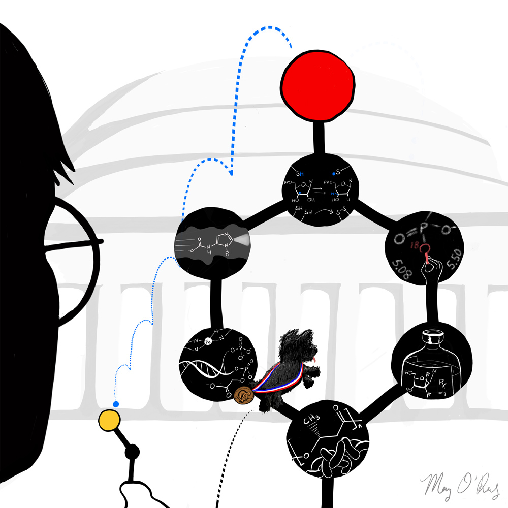
Many times since graduate school I have heard an earnest voice in my head saying, "What is the evidence?" It was probably the most important lesson that JoAnne Stubbe gave me as the chair of my thesis committee. In many ways a paradox, she is an intimidating but caring mentor, harshly critical and yet hugely inspiring, small in stature but an absolute powerhouse. I had the opportunity to work with her recently and when she told me she was retiring I felt compelled to do something. Bouncing ideas off of her former grad students Debbie Perlstein and Mo Seyedsayamdost, we came up with this, which was used this weekend in the program for her two day long send-off, as well as apparently on screen for an introduction and in a poster that all of the attendees signed. Debbie and Mo came up with the ideas to have the cysteine in the distance accepting the radical, which travels from a tyrosine residue via a proton coupled electron transport mechanism, as well as to use the NCAIR intermediate in the 10:00 slot to highlight her contributions to mapping out the pathway of purine biosynthesis, and to show the strange 3' end modification of DNA cleaved by bleomycin. I think my favorite circle is the teaching one, where she is drawing a phosphate group on the chalkboard. As a testament to her magical teaching abilities, my older brother, a lawyer, attended her enzymology class one day with me during a visit in 1999. To this day, he attests that everything he knows about science is that red chalk means radioactive.
Sneak preview of the May installment of The Short Answer
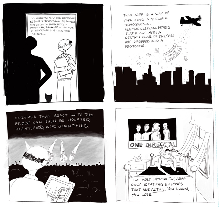
Just a very rough sketch of a portion of the next comic, wherein I attempt to explain the difference between activity-based protein profiling and traditional proteomics in the context of the census. I usually don't even start these until a couple of weeks before the posting date but since I got an early start I thought I'd share some progress.
Cartoon Abstracts and Scribble Sketching
I am excited to report that after two years of doing The Short Answer for my own amusement, I have been commissioned to do some paid science comics for the publisher Taylor and Francis, which has recently been producing cartoon abstracts. You can check them out HERE. I learned about them while browsing the expo at the ACS meeting in March. When I saw them displayed at the T&F booth I almost fell over myself to grab one and interrogate the poor representative in spewed sentence fragments "What is? Who does? I do this!!" She was very kind and asked for my card which I did not really expect to make it all the way back to the UK. But a few weeks ago I was contacted by them and here we are. I can't show any yet but I do have a few in the works.
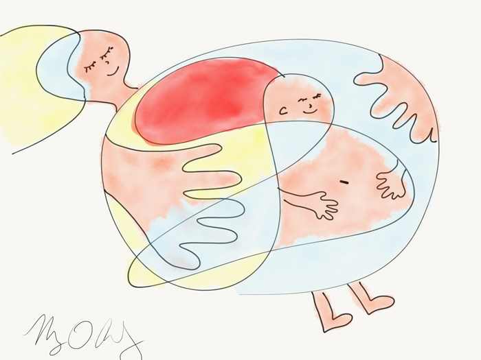
This opportunity couldn't have come at a better time because I just splurged on an iPad Pro and Apple pencil and have been eager for drawing-heavy projects. This new set-up has completely streamlined my process, no longer archaically scanning pencil sketches and then painstakingly tracing them with a mouse. However, finding myself rather gnarled after finishing the first comic I realized that I needed some ergonomic improvements. After a frustratingly long search for something to prop up the iPad, I threw up my hands, closed all of the browser tabs with $60 stands, and went to my bookshelf. I placed Linus Pauling's General Chemistry textbook (© 1947) within the pages of a larger coffee table book, A Life in Illustration (by Gestalten), with some post-it note pads tucked in to protect the pages. The drawing angle was perfect. Then it was just a matter of some tacky (as in slightly sticky, not garish) foam paper and a binder clip. It's not a permanent solution but I'm not convinced that a $60 stand will be any better. To try it out I did a scribble sketch (below), wherein you start with a random scribble, decide what it looks like, and then finish it in 10 minutes or less. Kind of like a Rorschach Test (but don't read anything into mine) turned drawing assignment. By the way this is a really fun way to draw with little kids. I don't dare touch my 4-year old's drawings - he can do this exercise himself, but my 1-year old is still delighted when I turn his scribbles into dinosaurs and such.
Communicating visually about communicating visually
Earlier this week I had the opportunity to run a workshop on science visualization with the wonderful Milena Gavala (right) of Curious G Design Studio. Under the rather unforgiving spotlights of the Sanford Consortium for Regenerative Medicine's auditorium we spent about two and a half hours with grad students and postdocs from UCSD's Center for Aerosol Impacts on Climate and the Environment (CAICE). They drew for us process diagrams of how to make toast, they sweated over design briefs for imaginary audiences ranging from high school students to grant funding agencies, they debated the merits of dual axis plots and discussed the challenges of conveying the most amount of information with the least amount of ink. Their eagerness and sense of humor made this all great fun, and because CAICE has 6 centers it seems we may be able to do more of this. During the panel discussion that followed I got to meet a lawyer who was involved in the California Chrome 6 litigation and respectfully refrained from asking whether anyone played him in Erin Brockovich or if he got to meet Julia Roberts.
The March installment of The Short Answer
It occurred to me that I didn't really know what I was trying to prove by restricting myself to an 8.5x11-in format for this, so I'm trying out a longer version. Why not. It's the two-year anniversary of The Short Answer this month and I'm still experimenting with it.
By the way, the Kandinsky-style data visualization was inspired subliminally by the actual Kandinski painting displayed on the Blackwell lab's homepage. I didn't realize until I was about halfway into the project that that was where the idea came from, and I don't know if this is what inspired them about it, but I like the analogy nonetheless.
Doodling at ACS San Diego
All right well it didn't turn out to be visual scribing so much as doodling, but here are a few highlights.
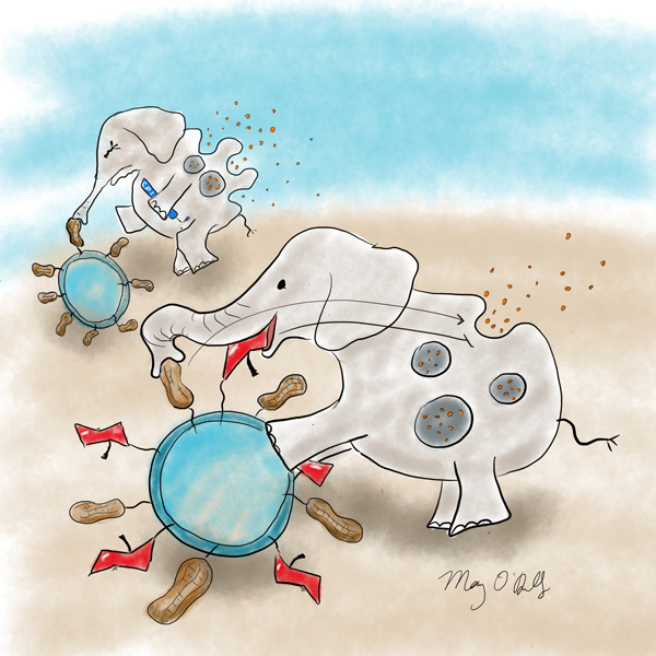
This first one is about Jim Paulson's talk. It is possible that I was particularly inspired by this talk because Jim was my postdoc advisor. Among other things the talk was about using nanoparticles to present carbohydrate ligands (red apples) in conjunction with an antigen (the peanut antigen in this case) to induce tolerance in mast cells. The reason for this is that the carbohydrate receptor, a Siglec, is an inhibitory receptor that dampens antigen-induced activation of the cells.
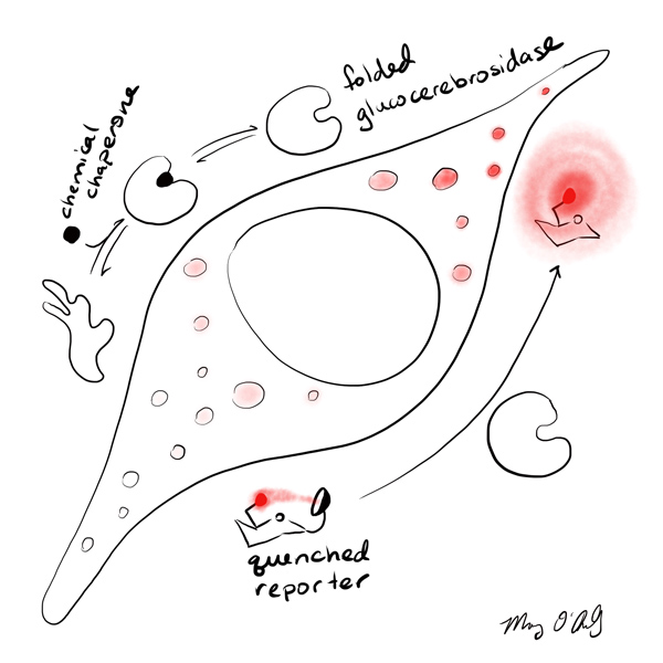
David Vocadlo talked about a system he designed to monitor glucocerebrosidase activity in lysosomes of live cells. Mutations in glucocerebrosidase are responsible for Gaucher's disease, and are a risk factor for Parkinson's disease. Chemical chaperones are used to help fold this enzyme, and David's probes can assess how well those chaperones are working. Active (ie. folded) enzyme cleaves off a fluorophore quencher (a really, really good one), causing lysosomes to light right up.
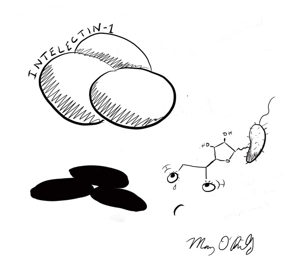
Finally, Laura Kiessling talked about a lectin called Intelectin-1 that was initially discovered in frogs but is found in all mammals, and has the capability of recognizing a furanose diol on the surface of many microbes, while totally ignoring mammalian glycans. Intelectin-1 therefore may have a role in immune surveillance.
Look for me at the ACS Meeting
I will be in attendance next week at the ACS meeting in San Diego, mostly in the CARB, ORGN, and BIOL sessions, roughly in that order. I thought I'd take advantage of the meeting being local to see some talks, catch up with friends and clients, and maybe even try my hand at visual scribing, which is apparently a thing now. What I've seen of it so far looks pretty intense, but I do love the idea of illustrating talks on the spot. Sort of a mobile The Short Answer. A lot of companies are hiring illustrators to come to their meetings and doodle this sort of visual summary, or note-taking of the key points.
I don't really have an image to go with this post, as I have not visually scribed, or scribben, anything yet. Instead here is a completely irrelevant and gratuitous image that I made as candidate cover art for Cell last year. It's about a device that is implanted into mouse heads that can deliver liquids and light to the brain simultaneously by remote control.
Not now Mom we're working
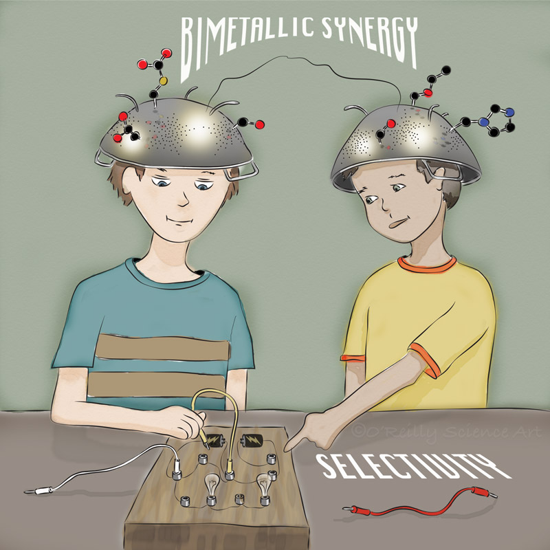
Here's an image I did for the Mankad group at the University of Illinois at Chicago that came out today as a frontispiece to a concept article in Chemistry: a European Journal. It is about how catalysts with two metallic centers can cooperate to have superior properties, like better selectivity, over those with just one metallic center. For the inspiration for this piece I'd like to thank Rick Moranis's character from Ghostbusters, Pastafarians, and my sons, who don't look anything like the kids in this illustration but who do communicate with each other on a frequency unbeknownst to anyone else.
Mankad, N. P. “Selectivity Effects in Bimetallic Catalysis.” Chem. Eur. J. 2016, 22, Early View, doi: 10.1002/chem.201505002.
January Installation of The Short Answer
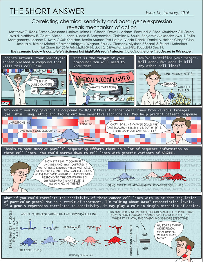
I spent about a week mulling over this paper in the back of my head, and I became fixated on coming up with a good metaphor to describe it. But, it is really complicated and I came to the conclusion that I would just end up having to explain the metaphor, which kind of defeats the purpose. Instead I took the approach of trying to explain it as well as I could by including prior work that puts this paper into perspective, and by walking through a fictional narrative that illustrates the early stages of the struggle of moving from hit to drug. In fact, the subject of this paper doesn't even come up until the last frame. But I hope it gives you a foothold to understand how a massive collection of data can help explain the mechanism of action of cancer drugs, and if you want to know more, check out the paper and the Broad Institute's Cancer Therapeutics Response Portal, where this treasure trove of data lives.
Click HERE for a pdf of this issue.
How we stop bacteria from turning us into the cellular equivalent of lambchobs
Here's a cartoon animation I did recently for a video highlighting recents advances from Sean Stowell's group at Emory University's School of Medicine. I landed this project thanks to a Short Answer I did on the subject in May of 2014, that alone making it a better marketing tool (though it was not at all intended as such) than sending out dozens of mailers, which I did years ago to no avail.
These carbohydrate-binding proteins called galectins can fill a gap left in our immune system. You know how you can get a blood transfusion with someone else's blood as long as they have the same blood type, right? Turns out bacteria have found a way to exploit this and decorate themselves with those same blood group antigens, thus evading the immune system of anyone with the same "blood type" as them. Hence the idea of wolf in sheep's clothing. Luckily we have galectins that can kill these sneaky little microbes. Watch Sean below for a better explanation. Or read the blog post by Quinn Eastman at Emory, where this video appears, HERE.
Full story http://bit.ly/1OTFxY6 - Emory University's Sean Stowell and colleagues explain how galectins can be compared to sheep dogs, which are vigilant in protecting our cells (sheep) against bacteria that may try to disguise themselves (wolves).
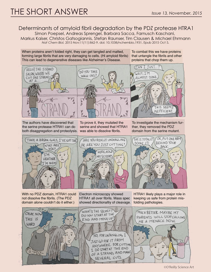
The, ahem, November installment of The Short Answer
This is ridiculously late. The sad thing is that I finished it last weekend and then forgot about it because I have five projects right now (down from seven). Freelance is always feast or famine and I guess everyone wants to wrap things up before the end of the year. Not complaining. Anyway, here is the latest. I am toying with the idea of making The Short Answer purely a comic, as opposed to my previous design (background, hypothesis, approach, results, conclusions). As it turns out, this is WAY more work, especially when drawing people is involved. Maybe I'll go back to drawing zebrafish. Better yet, there will surely be a good paper out on C. elegans next month...
When a Target gift card just won't cut it
Lately I've been getting requests for artwork to be given as gifts, which is something that I never would have even thought to offer as a service, but it is such a great idea. In this Etsy era of handmade personalized gifts, what's more personal than a gift that celebrates someone's specific contributions to science? While I was wondering why I never thought of this before, I realized that I've sort of been doing it for years. For instance I often draw Valentine's Day cards that are based on the science that the hubs is doing at the time. I remember one card during his postdoc that read, "Roses are red, Violets are blue, If you were a phosphotyrosine, I would be SH2." Or something like that. It never occurred to me that this could be done on a larger scale.
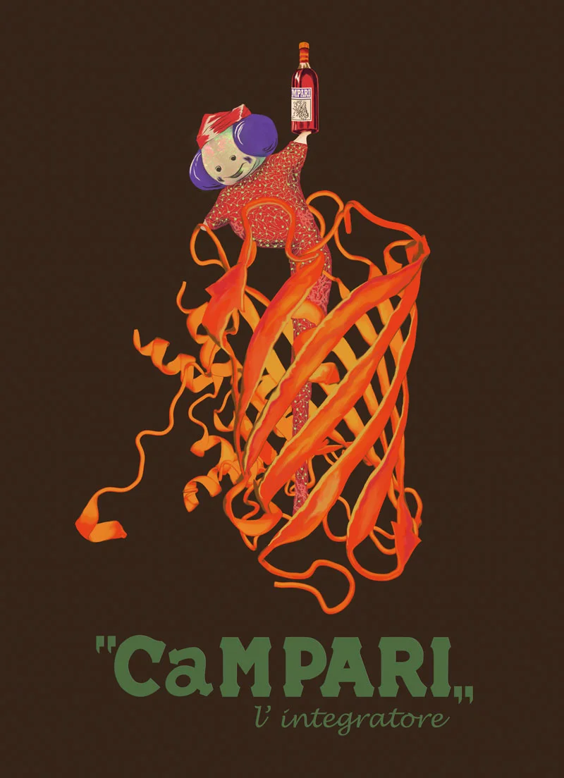
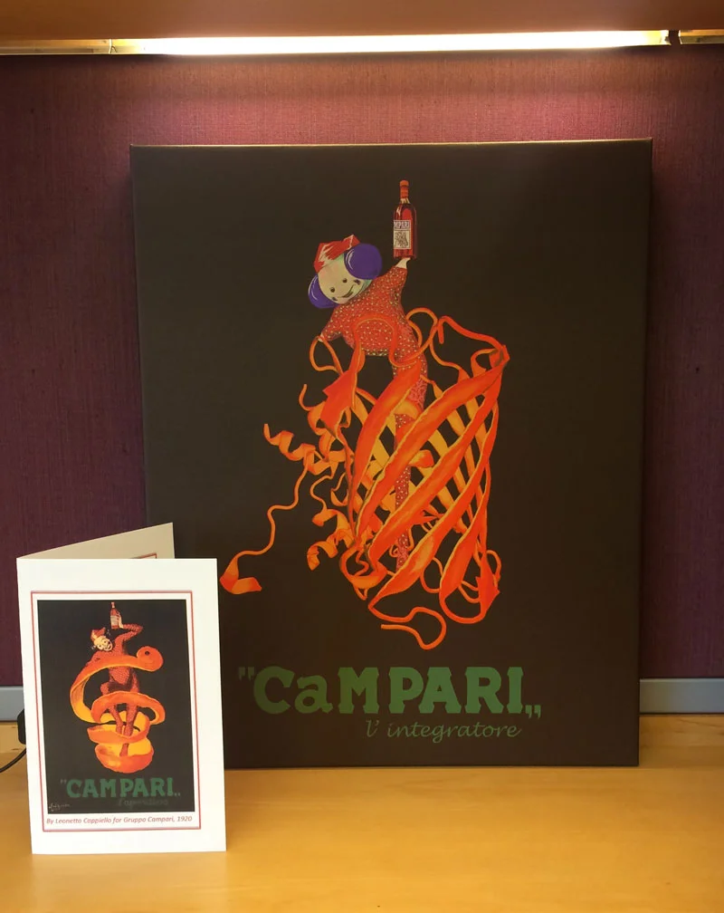
One recent request came from the wife of a researcher at HHMI's Janelia Research Campus. He had published a paper in Science and was about to be promoted to group leader. She wanted something special to mark these exciting (and apparently unrelated) events, and thought that some original artwork for his new office would be just the thing. So I read the Science paper, which is about a calcium-binding fluorescent protein they designed that can detect activation of neurons by their change in calcium concentration. Upon action potential firing, calcium ions barge into the cell, and that leads to a shift from green to red fluorescence of the protein when hit with a certain wavelength of light. Using this probe, they were able to image the whole brain in mice, flies, and, remarkably, freely swimming zebrafish larvae. They saw specific regions of the brain lighting up when the organisms did things like smell an aromatic compound, "hear" a specific vibrational frequency, or have to process the changing directions of a grating. I assume the last one lights up the part of the brain that gets activated when I have to look at a map upside down. Actually I think the portion of my brain that is supposed to carry out that function has been replaced by recordings of Yakety Sax, aka the Benny Hill theme song. Anyway, this calcium-sensing protein is called calcium-modulated photoactivatable ratiometric integrator, or CaMPARI, which is also a popular red-colored liqueur known for its bitter flavor. When I started looking at some old posters for Campari the aperitif, I came across the original 1920's poster depicting a clown inside of an orange peel holding a bottle of Campari. The orange peel reminded me of the structure of CaMPARI, so I thought it would be funny if the clown was replaced with a cute little zebrafish larva and the orange peel by the actual protein structure. You can't really tell in this image, but the original clown has white polka dots on his red pajamas. These were replaced by neurons on the zebrafish (my client's idea). Most of them are green, but in a few small regions they are lighting up red. The recipient of this bizarre parody found it in his new office alongside a card with the original poster image as shown below. I was relieved to hear that he was quite pleased with it.
In another project, the sister of a soon-to-be assistant professor of polymer science and engineering contacted me to commission a piece of artwork for her brother's new office. His work has two main themes. One is optically functional polymers, so for example, a polymer that can take light and convert it to a higher frequency. The other is stimuli-responsive materials, or polymers (generally) that change properties (ie. color, local concentration of a molecule, etc.) when stimulated with something like light, mechanical stress, etc. Interestingly, the sister who hired me is a Ph.D. biochemist. I am working on tracking down the parents for their playbook.
I have two more of these possibly in the works and I hope it catches on. It's fun to be a part of such a thoughtful gesture. I am inspired to up my game this Christmas.
