The recent Chemical Science cover below was developed from a concept I used for candidate cover art three and a half years ago with the same client, the Mankad Lab at The University of Illinois - Chicago. It was originally made for a JACS cover (see bottom image), but as I now understand, JACS editors generally seem to prefer eye-catching images of chemical structures, with minimal interest in the metaphorical, whimisical, or comical. My client had the idea to reprise it and lo and behold it worked!
The Art of Basic Science #4
On this April Fool's Day I decided to feature a guest post for the fourth installment of this series. The guest is my 5-year old son, who stated his intention to grow up to be a scientist, and then someone who draws science to explain it to other people. This was quite a departure from fire-fighting astronaut, but I suspect he began to realize that the lack of oxygen in space might impact his employment prospects.
I sometimes take advantage of time spent "coloring" with the kids to sketch out ideas for projects. But it was just a week ago that my 5-year old wanted to start copying what I was drawing. Which is how he came to be a guest illustrator for this series. This drawing comprises DNA polymerases, nucleotide triphosphates, methylated template DNA, PCR products (both pictorial and in-gel), and the hydrogen-bonding pattern of a DNA adduct to a cognate non-natural nucleoside. My sketches are pretty rough so I must admit that it isn't a very big stretch from my version.
This installment is inspired by work in Shana Sturla's lab at ETH.

The Art of Basic Science #3
Flexibility of substrates has been found to play a key role in the action of Fatty Acid Amide Hydrolase (FAAH), a critical enzyme of the endocannabanoid system. This image was inspired by the work of Marco DeVivo's lab at the Molecular Modeling & Drug Discovery Lab, which is part of the Istituto Italiano di Tecnologia in Genoa, Italy,
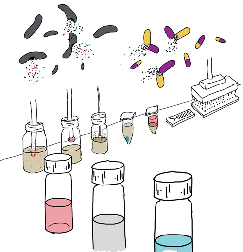
The Art of Basic Science #2
Here is the second installment of the series I introduced here on January 1st. Recently I became briefly obsessed with patterns, related perhaps to the nostalgic feeling I get any time I see 1970's wallpaper. In spite of my most earnest efforts toward minimalism, sometimes I have to give in to the urge. In my defense, I thought this might be a good way to evoke a sense of the complexity of cellular systems.
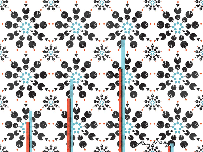
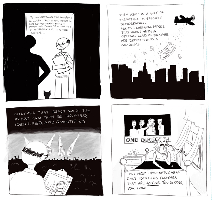
In the pattern above, the Pac-men are enzymes that use reactive cysteines in their active sites to carry out their jobs. The triangles are groups that latch onto cysteine if its thiol is available and sufficiently reactive, and these groups are tagged with tracers that are either heavy (red) or light (blue) so when used in parallel, changes in reactivity within the same enzyme upon treatment of some sort can be revealed. It is a clever method for making mass spectrometry, a technique that is not necessarily quantitative by nature, quantitative. If there was a way to do that for humans, maybe I would still be at the bench. Anyway, for the vast majority of enzymes that react with the probe, there will be equal amounts with heavy and light tracers, meaning there was no change in reactivity associated with the treatment. But, when you discover enzymes that have blue:red ratios other than 1, like in the overlaid trace above, then you may have just discovered a previously unknown function for an enzyme, a clue to a regulatory mechanism, or even a new drug target.
The inspiration for this comes from a plethora of papers from the Weerapana Lab at Boston College, which has pioneered the method for this purpose.
Check back March 1st for the next installment!
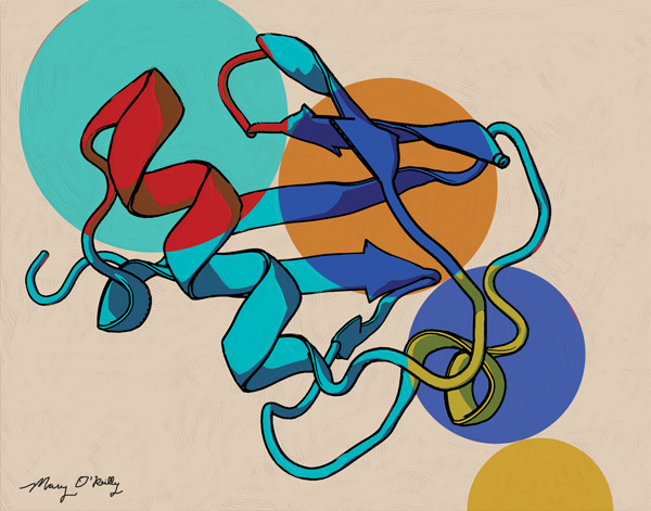
Publishing in style
Here are a couple of figures I made for recent papers out of the Soh Lab at Stanford. I've been fortunate to do a number of projects with them, and what's nice about developing a relationship with a lab like this is that I can try to develop a consistent and recognizable style for their figures. There's a precipitous drop in cost after the first one or two figures since I have become familiar with their science and the aesthetic style has been established. And besides, I get to know the grad students and post docs with whom I hope to populate my future client pipeline, mwah ha ha.
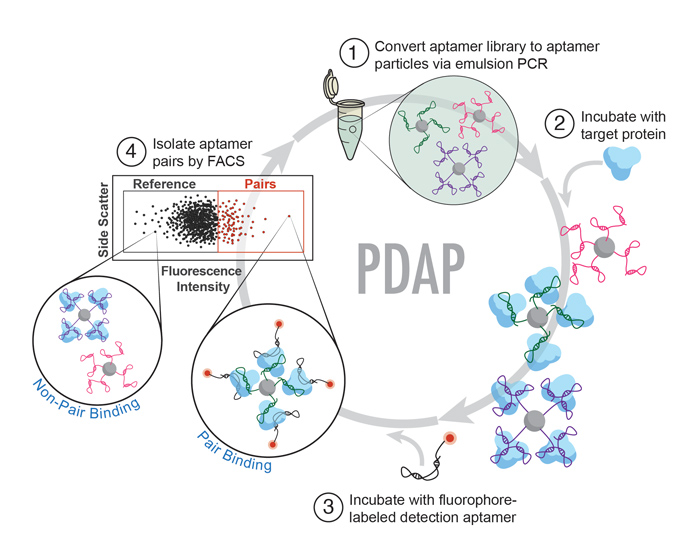
![Angew Chem Int Ed Engl. 2016 Dec 9. doi: 10.1002/anie.201608880. [Epub ahead of print]Multiparameter Particle Display (MPPD): A Quantitative Screening Method for the Discovery of Highly Specific Aptamers.Wang J, Yu J, Yang Q, McD…](https://images.squarespace-cdn.com/content/v1/50f8f68fe4b0df5f0985b8b8/1483655757819-G33ZRKRJWW6EPBYSPHQR/image-asset.jpeg)
Angew Chem Int Ed Engl. 2016 Dec 9. doi: 10.1002/anie.201608880. [Epub ahead of print]
Multiparameter Particle Display (MPPD): A Quantitative Screening Method for the Discovery of Highly Specific Aptamers.
Wang J, Yu J, Yang Q, McDermott J, Scott A, Vukovich M, Lagrois R, Gong Q, Greenleaf W, Eisenstein M, Ferguson BS, Soh HT.
High-Throughput Discovery of Aptamers for Sandwich Assays.
Csordas AT, Jørgensen A, Wang J, Gruber E, Gong Q, Bagley ER, Nakamoto MA, Eisenstein M, Soh HT.
Anal Chem. 2016 Nov 15;88(22):10842-10847.
The Art of Basic Science
Happy New Year everybody! Usually at this time of year I post about the O'Reilly Science Art holiday party of two, but the hubs and I couldn't secure a sitter this year. Instead, I am eager to announce a new series for this website. While I love doing The Short Answer and would be thrilled if anyone commissioned me to do one for their work, I had a feeling that after two years here it had run its course. So lately, I've been cooking up a new series that uses a more fine art-inspired brand of illustration to celebrate everyday discoveries in chemistry and biology. They won't be the stories you see in the New York Times or on Nova, but the indispensable yet unsung advances upon which those larger discoveries are built. So I give you, The Art of Basic Science.
The inaugural piece was inspired by a new tool that helps to show us what de-ubiquitylating enzymes are doing (see reference to paper below image). For a long time we thought of ubiquitylation as a simple tag for proteins on the way to the cellular landfill, but we are beginning to understand the dynamic and modular nature of this post-translational modification and its importance in a number of disorders. The artwork, loosely inspired by the likes of Klee and Kandinsky, is meant to illustrate the beauty of ubiquitin itself, its propensity for forming chains which are typically represented as a series of circles, and to invite you to imagine these circles being removed and replaced in a dynamic fashion.
Selenocysteine as a Latent Bioorthogonal Electrophilic Probe for Deubiquitylating Enzymes
Samuel D. Whedon, Nagula Markandeya, Ambar S. J. B. Rana, Nicholas A. Senger, Caroline E. Weller‡, Frantisek Tureček, Eric R. Strieter, and Champak Chatterjee
J. Am. Chem. Soc., 2016, 138 (42), pp 13774–13777
Saving clients money one carbon footprint at a time
This is a graphical abstract I did for a paper published by a group at the La Jolla Institute for Allergy and Immunology (see reference below image). Since the lab is local, I was able to meet with them in person to talk about the project, and here is how this entire project was completed in only 6 hours. The night before we met, I read their paper. The next morning, I drove down to La Jolla, and on the way I had an idea. Getting there a little early, I was able to sketch it out in my car before I went in. We fleshed it out on the white board and I was back in the car 25 minutes later. I went home and drew it. That was pretty much it. As much as I dislike driving, I know that it is a great time to get ideas, much like being in the shower, which is the primary way that I come up with them. But if someone could just tell me one way to get ideas without wasting natural resources I would be much obliged. Thanks.

Thomas GD, Hanna RN, Vasudevan NT, Hamers AA, Romanoski CE, McArdle S, Ross KD, Blatchley A, Yoakum D, Hamilton BA, Mikulski Z, Jain MK, Glass CK, Hedrick CC.
Immunity. 2016 Nov 15;45(5):975-987. doi: 10.1016/j.immuni.2016.10.011.
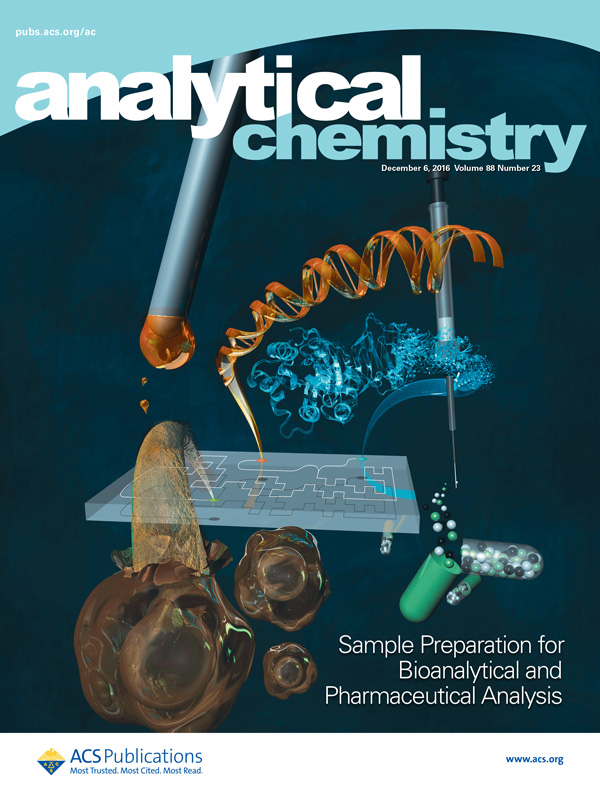
Anderson Lab feature article gets the cover
This cover that I made for Jared Anderson's group at Iowa State University just came out. It highlights a feature article they wrote about sample preparation for bioanalytical and pharmaceutical analysis. I learned that we've come a long way from phenol-chloroform extractions as the main way we get DNA from cells. For anyone who knows anything about this, I am dating myself, but the first experiment I ever did in a non-classroom laboratory started with doing mini-preps using phenol-chloroform extraction. By the time I got to grad school we used these adorable little centrifuge tubes equipped with filters to do mini-preps, and you could finish one before your coffee got cold on your desk. Now they're using microfluidics to separate DNA from proteins and other flotsam and jetsam. I know very little about microfluidics, but I am always reminded of a seminar I saw over a decade ago at MIT from an up and coming Rustem Ismagilov, a professor at CalTech. It was common for researchers to photograph their microfluidic devices next to a penny to demonstrate the impossibly small size they were able to achieve. Professor Ismagilov told us how, as he embarked on this field of research, the first thing he did was to go out and get a really really big penny. Maybe the funniest thing I've ever heard in a seminar.
Below are the sketches I presented to the Anderson Lab for consideration. They discuss many techniques in the paper (magnetic ionic liquids, solid phase extraction, etc.) so it was a challenge to try to work in as many as I could. They chose the second sketch. I don't know the reason, but maybe having the bacteria and pills looking like so many college freshman was a bit much.
Weerapana Lab website gets a long overdue upgrade
When my good pal Eranthie started her lab in Boston College's chemistry department, I illustrated a home page image for her (below). It lived there for 6 years.

It's pretty generic and outdated, way too superhero comic-y, and frankly I generally don't like to look at anything I made that long ago. But because she is way too loyal I knew she would never change it unless I made something to replace it. So as a gift to congratulate her on getting tenure, I came up with three new designs. Her students voted and chose the one below. I like it now but I'm sure I'll be ashamed to look at it by the time she gets promoted to full professor. At least I hope so.

A throwback in honor of the 2016 Nobel Prize in Chemistry
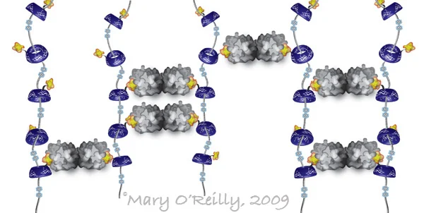
When I was a postdoc in Jim Paulson's lab studying multivalency in protein-carbohydrate interactions, I was invited to the Frie Universitat in Berlin to give two talks, one about multivalency in nature and chemical methods to mimic it, and one specific to my own research. I made the illustration below for the former, to describe a self-assembled pseudopolyrotaxane, often described as the molecular equivalent of beads on a string. It was developed in the lab of Fraser Stoddard, one of the three winners of the Nobel Prize in Chemistry that was just announced. In this collaboration with Linda Baum's group, they built a scaffold of the pseudopolyrotaxane that multivalently displayed a carbohydrate ligand (in yellow), and precipitated its dimeric cognate lectin, galectin (in gray), by forming cross-links like you see in the illustration. The circles you see in between the "beads" are positive charges that act as speed bumps, to stall the beads from just falling off of the string. I remember thinking that this was incredibly cool, and in retrospect apparently just the kind of ingenuity that puts you in line for a Nobel Prize. Looking back on this illustration reminds me of how immensely satisfying I found it to create all of these new illustrations for my talks. I was just on the cusp of letting go of the idea of an academic career in favor of, for lack of a less cliché phrase, following my dream. But at the time I was my only client, and I didn't pay well. Somehow I didn't enjoy it any less.
Transcription factors: the high school guidance counselors of the cells
I was commissioned by the DeVal Lab at the Ludwig Institute in Oxford to create this little animation that explains very simply for a general audience how different transcription factors trigger cells to become either arterial or venous cells. The lab was an absolute dream to work with and the animation has been a lot of fun to make. And how lovely is it with the British-accented voiceover done by the client? People pay good money for that here!
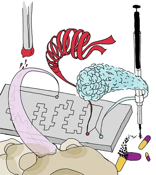
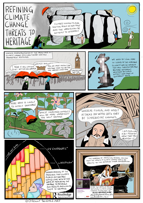
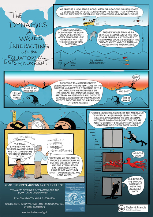
After 2 years of Short Answers for my own amusement, a real comics commission
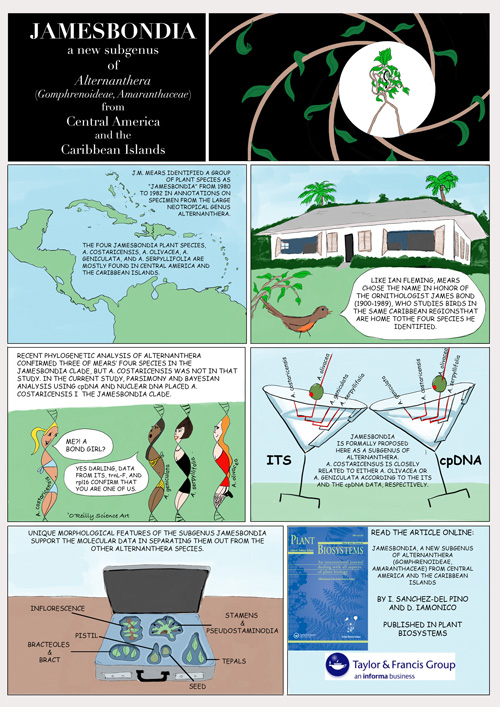
As I mentioned in my May 6th post, I was commissioned by the publisher Taylor & Francis to contribute to their cartoon abstracts project. The comics I made are all online now so I can share with you the three I did. For the most part I was provided with the text, but I still found myself doing tons of research to figure out what to draw. I made all of these on my new iPad Pro with Apple pencil using the suggestively named software known as Procreate. (It should go without saying that no one is paying me for mentioning any of this.) Anyway, it was nice to be untethered from my desktop behemoth for a while to do these but now I'm back in the office with a series of new projects, all of which are figures for publication. I am wondering whether this has any correlation to the recent article in Nature Careers (HERE) that extolled the virtues of hiring a professional for one's scientific figures and used examples of several science illustrators, including myself. If so, thanks Nature!
If you want to see more cartoon abstracts, presumably done by artists with much more cartooning experience than me, you can find them all HERE.
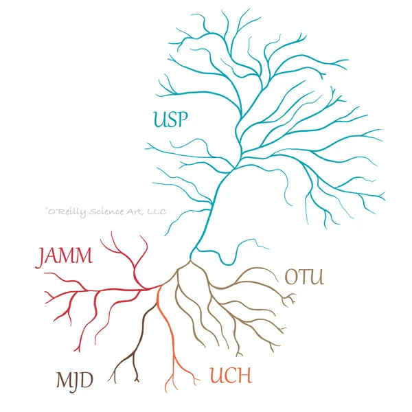
DUBs for the win
Here's a little dendrogram of de-ubiquitinases (aka DUBs) that I stylized for a client. Less than a week went by between receiving the e-mail requesting the artwork and getting paid for said artwork, making this project the new record-holder.
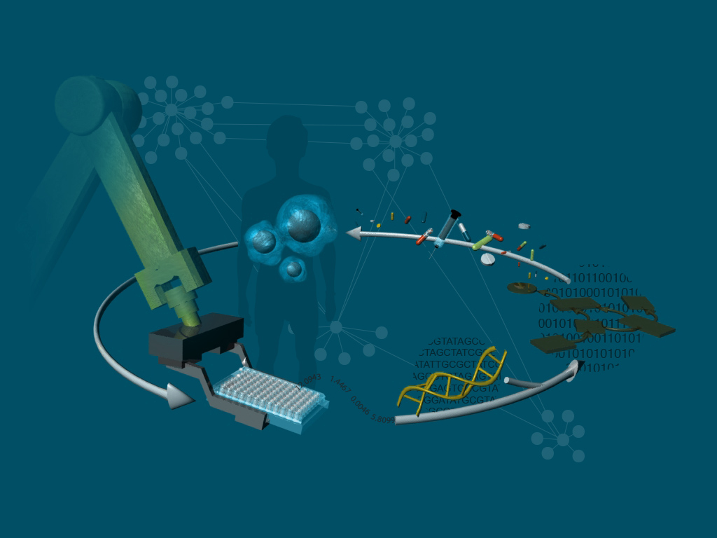
Landed a landing page for Salgomed, Inc.
It is actually pretty rare that I work with labs that are local, so it's always a pleasure when I can meet with clients in person. This image was made for the San Diego biotech company Salgomed, Inc., but I met with the CEO in his office at The Sanford-Burnham Prebys Medical Discovery Institute where I was treated to a Nespresso and a lovely conversation about their work. They have developed an algorithm that takes assay data, generated in their own lab, and makes predictions about drug combinations that will effectively treat certain cancers. Those combinations go back into assays and this iterative process leads to increased specificity to the desired therapeutic response. Oh, and they use robots.
Please welcome, ASSOCIATE professor Eranthie Weerapana!
My friend Eranthie, who despises having so much as her photo taken, was requested by Boston College's Institute on Aging to have a video produced describing a branch of her research program that looks for longevity-related protein activities in C. elegans. She asked for help with the graphics so I did my best to fill the screen time with animations for her. I cannot take credit for the stock photos or the footage of real C. elegans, those were added by someone else. This ambitious project was wrapped up over the holidays by a Christmas miracle, but was just recently posted. Oh and in the meantime, by the way, just a little thing, she GOT TENURE!!! CONGRATULATIONS!!!!!!
Red chalk means radioactive
Many times since graduate school I have heard an earnest voice in my head saying, "What is the evidence?" It was probably the most important lesson that JoAnne Stubbe gave me as the chair of my thesis committee. In many ways a paradox, she is an intimidating but caring mentor, harshly critical and yet hugely inspiring, small in stature but an absolute powerhouse. I had the opportunity to work with her recently and when she told me she was retiring I felt compelled to do something. Bouncing ideas off of her former grad students Debbie Perlstein and Mo Seyedsayamdost, we came up with this, which was used this weekend in the program for her two day long send-off, as well as apparently on screen for an introduction and in a poster that all of the attendees signed. Debbie and Mo came up with the ideas to have the cysteine in the distance accepting the radical, which travels from a tyrosine residue via a proton coupled electron transport mechanism, as well as to use the NCAIR intermediate in the 10:00 slot to highlight her contributions to mapping out the pathway of purine biosynthesis, and to show the strange 3' end modification of DNA cleaved by bleomycin. I think my favorite circle is the teaching one, where she is drawing a phosphate group on the chalkboard. As a testament to her magical teaching abilities, my older brother, a lawyer, attended her enzymology class one day with me during a visit in 1999. To this day, he attests that everything he knows about science is that red chalk means radioactive.
Sneak preview of the May installment of The Short Answer
Just a very rough sketch of a portion of the next comic, wherein I attempt to explain the difference between activity-based protein profiling and traditional proteomics in the context of the census. I usually don't even start these until a couple of weeks before the posting date but since I got an early start I thought I'd share some progress.
Cartoon Abstracts and Scribble Sketching
I am excited to report that after two years of doing The Short Answer for my own amusement, I have been commissioned to do some paid science comics for the publisher Taylor and Francis, which has recently been producing cartoon abstracts. You can check them out HERE. I learned about them while browsing the expo at the ACS meeting in March. When I saw them displayed at the T&F booth I almost fell over myself to grab one and interrogate the poor representative in spewed sentence fragments "What is? Who does? I do this!!" She was very kind and asked for my card which I did not really expect to make it all the way back to the UK. But a few weeks ago I was contacted by them and here we are. I can't show any yet but I do have a few in the works.
This opportunity couldn't have come at a better time because I just splurged on an iPad Pro and Apple pencil and have been eager for drawing-heavy projects. This new set-up has completely streamlined my process, no longer archaically scanning pencil sketches and then painstakingly tracing them with a mouse. However, finding myself rather gnarled after finishing the first comic I realized that I needed some ergonomic improvements. After a frustratingly long search for something to prop up the iPad, I threw up my hands, closed all of the browser tabs with $60 stands, and went to my bookshelf. I placed Linus Pauling's General Chemistry textbook (© 1947) within the pages of a larger coffee table book, A Life in Illustration (by Gestalten), with some post-it note pads tucked in to protect the pages. The drawing angle was perfect. Then it was just a matter of some tacky (as in slightly sticky, not garish) foam paper and a binder clip. It's not a permanent solution but I'm not convinced that a $60 stand will be any better. To try it out I did a scribble sketch (below), wherein you start with a random scribble, decide what it looks like, and then finish it in 10 minutes or less. Kind of like a Rorschach Test (but don't read anything into mine) turned drawing assignment. By the way this is a really fun way to draw with little kids. I don't dare touch my 4-year old's drawings - he can do this exercise himself, but my 1-year old is still delighted when I turn his scribbles into dinosaurs and such.
Communicating visually about communicating visually

Earlier this week I had the opportunity to run a workshop on science visualization with the wonderful Milena Gavala (right) of Curious G Design Studio. Under the rather unforgiving spotlights of the Sanford Consortium for Regenerative Medicine's auditorium we spent about two and a half hours with grad students and postdocs from UCSD's Center for Aerosol Impacts on Climate and the Environment (CAICE). They drew for us process diagrams of how to make toast, they sweated over design briefs for imaginary audiences ranging from high school students to grant funding agencies, they debated the merits of dual axis plots and discussed the challenges of conveying the most amount of information with the least amount of ink. Their eagerness and sense of humor made this all great fun, and because CAICE has 6 centers it seems we may be able to do more of this. During the panel discussion that followed I got to meet a lawyer who was involved in the California Chrome 6 litigation and respectfully refrained from asking whether anyone played him in Erin Brockovich or if he got to meet Julia Roberts.
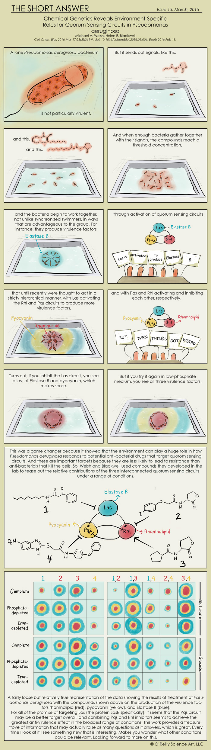
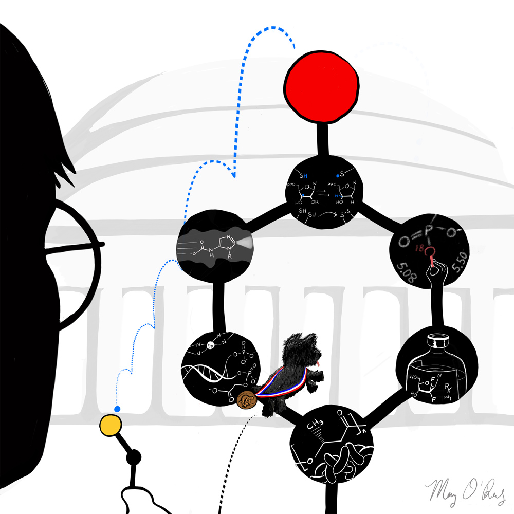
The March installment of The Short Answer
It occurred to me that I didn't really know what I was trying to prove by restricting myself to an 8.5x11-in format for this, so I'm trying out a longer version. Why not. It's the two-year anniversary of The Short Answer this month and I'm still experimenting with it.
By the way, the Kandinsky-style data visualization was inspired subliminally by the actual Kandinski painting displayed on the Blackwell lab's homepage. I didn't realize until I was about halfway into the project that that was where the idea came from, and I don't know if this is what inspired them about it, but I like the analogy nonetheless.